Designed by: PepsiCo Design & Innovation
Country: United States

Hwila

Hwila

Designed by Neumeister | Country: Sweden

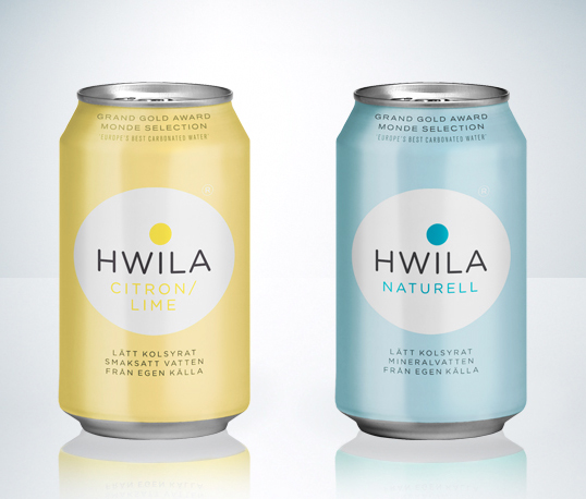
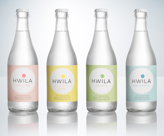
Input: Hwila is a natural mineral water from Vimmerby, Sweden, a brand owned by one of Sweden’s oldest breweries; Åbro. After many years Hwila needed an update — it was time to modernize, for a younger target group, without loosing the positive values connected with the brand.

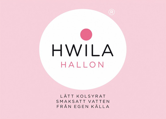
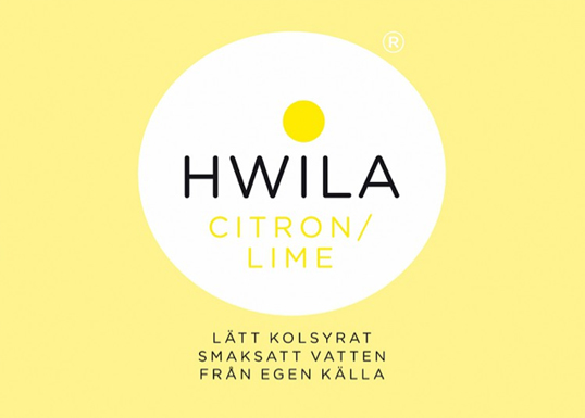
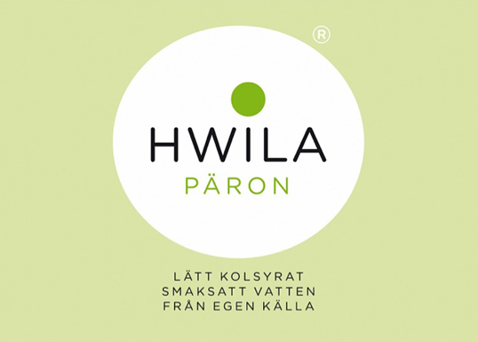
Output: With this redesign we were concerned to find a formula whereby it was possible to constantly being able to update the design, with out ever loosing contact with its heritage. The simplicity, purity — the restfulness — was the main idea were colours and shapes signal different variations of the mineral water – sparkling, non-sparkling, taste etc. A modern, youthful, design. Easy to apply on either cans, glass or PET-bottles. Large or small.

Outcome: Pure and rigorous, Hwila really makes a point in any store. Creating true shelf impact without screaming. Just released.”

Hwila

Hwila

Hwila

Hwila

Hwila

Hwila

Get the latest packaging design inspiration in your inbox:

Popular designs

D’eyras – Medrono & Olive Oil

What connects D´EYRAS, Medronho, and Olive Oil? They all hail from the same country: Portugal. These trees are indigenous to the region, serving as a testament to the bountiful and diverse Mediterranean flora.

Inverey: A Unique Barrel-Aged Scottish Gin Packaging Design

Inverey stands out with its image that captures the essence of the rugged Highland countryside. Breaking away from the norm, the label design does not feature the traditional tartan. Instead, it presents an organised structure of intertwining circles, rhombuses, four-pointed stars and dots born out of their intersection.

Designed by: PepsiCo Design & Innovation
Country: United States

Hwila

hwila1

Hwila

Designed by Neumeister | Country: Sweden

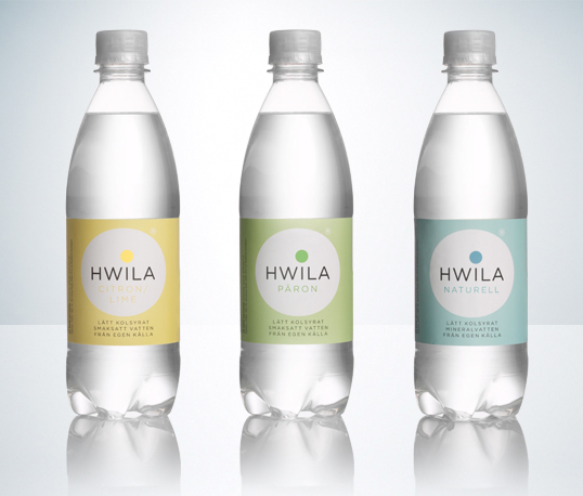
Input: Hwila is a natural mineral water from Vimmerby, Sweden, a brand owned by one of Sweden’s oldest breweries; Åbro. After many years Hwila needed an update — it was time to modernize, for a younger target group, without loosing the positive values connected with the brand.

Output: With this redesign we were concerned to find a formula whereby it was possible to constantly being able to update the design, with out ever loosing contact with its heritage. The simplicity, purity — the restfulness — was the main idea were colours and shapes signal different variations of the mineral water – sparkling, non-sparkling, taste etc. A modern, youthful, design. Easy to apply on either cans, glass or PET-bottles. Large or small.

Outcome: Pure and rigorous, Hwila really makes a point in any store. Creating true shelf impact without screaming. Just released.”
Hwila

Hwila

Hwila

Hwila

Hwila

Hwila

Previous slide
Next slide
Get the latest on packaging design in your inbox: