
Designed by Eduardo del Fraile | Country: Spain
“Range of toothpaste for a brand aimed at pharmacies. The concept is inspired by the silhouette of the toothpaste as it is squeezed out of the tube.”


Designed by Eduardo del Fraile | Country: Spain
“Range of toothpaste for a brand aimed at pharmacies. The concept is inspired by the silhouette of the toothpaste as it is squeezed out of the tube.”
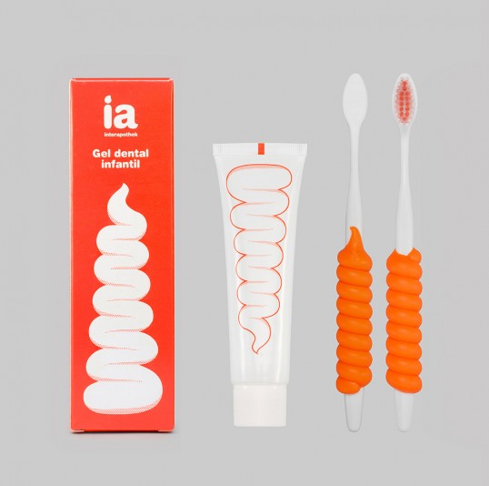


Designed by Eduardo del Fraile | Country: Spain
“Range of toothpaste for a brand aimed at pharmacies. The concept is inspired by the silhouette of the toothpaste as it is squeezed out of the tube.”