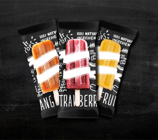
Designed by Beatrice Menis | Country: Sweden
“The goal was to communicate the tradition and the natural ingredients used for in the popsicles; this is the reason why we chose to combine handmade typography with the popsicle image. Here you can see the first three flavours but It Pops will be launching new flavours soon. At the same time we’re working with the brand identity and we will be uploading soon the visual communication and the stationery. Have a sneak peak at the packaging design for now!”