Designed by B&B studio | Country: united Kingdom
“B&B studio has rebranded Jealous Sweets, a UK entrepreneur looking to bring credibility to candy with its range of delicious and high quality sweets for grown-ups. Jealous specialises in gummy and jelly treats that are made without gelatine, artificial colours or flavours, so they’re 100% vegetarian, gluten-free and full of natural fruit juices.”
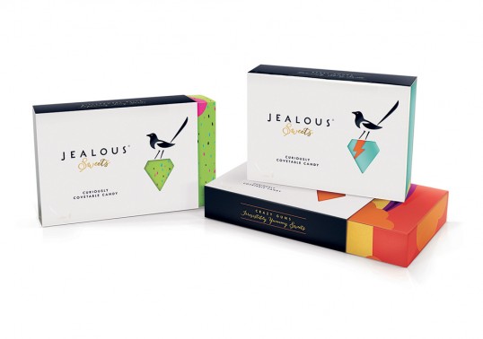
“The existing Jealous packaging wasn’t working hard enough to communicate the brand’s premium positioning and the purity of its products,” explains B&B studio Creative Partner Shaun Bowen. “And the Jealous name had no real link back to the sweets themselves. We set about linking the two through the idea of ‘covetable candy’ – a concept that we visualised using a precious jewel icon and a characterful Magpie with an eye for something special.”


“Giftability was key to differentiating the brand from the majority of the sweets market, so B&B studio took its inspiration from the chocolate category, creating desirable and detailed luxury boxes for an extra special experience. “The boxes comprise a die cut sleeve featuring glossing, embossing and foil blocking, which is secured by a gold foil tamper seal to a patterned lift-lid box,” says Shaun. “Inside, the sweets are collected in individual branded bags surrounded by layers of tissue paper for a premium feel.”


“A series of colourful patterns are used across the brand’s range to aid differentiation and visually represent the intense sweet, sour and fizzy taste explosion that you can only get from these type of sweets. “It’s about reminding grown-ups of those amazing taste sensations from childhood,” says Senior Designer Claudia Morris, “but presenting them in a way that’s absolutely contemporary and adult-oriented. And because the full pattern is obscured by the sleek and minimalistic black and white sleeve, you only get the full colour hit after purchase.”