Designed by: PepsiCo Design & Innovation
Country: United States

Juni

Juni

Designed by Only Creatives | Country: United States

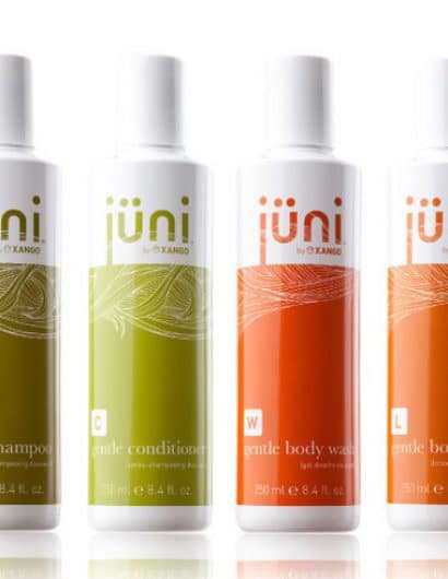
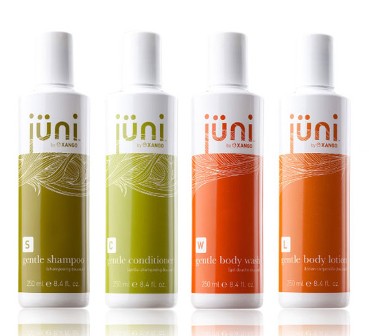
“Juni is an all-organic product line for hair and body formulated for gentle yet deep cleansing for the entire family. We started by employing vibrant colors that are indigenous to nature yet also convey a feeling of fresh organic cleanliness. The colors also serve to identify different sections of the product family with the green family representing ‘hair’ and the citrus orange and reds representing ‘body’. The usage of the hair pattern was to establish a subtle yet direct association with the hair and body as well as create a unique organic texture. Overall, we sought to create a design that is simple and natural as the product it contains.”

Get the latest packaging design inspiration in your inbox:

Popular designs

Art Meets Craftsmanship in BrewBeak Beer Series Packaging Design

“BrewBeak Beer Series Packaging Design artfully fuses craftsmanship and art, reflecting the brand’s philosophy and the beauty of nature. Through minimalist design and bird-themed illustrations, each package uniquely represents different beer varieties, creating a memorable and sophisticated brand identity.”

Luxurious Packaging Design for Saudi Chocolatier Fahda by TOLD

Discover how TOLD transformed the packaging of Saudi chocolate brand Fahda, creating an opulent unboxing experience with liquid gold lettering, cheetah iconography, and intricately embossed jungle landscapes. A luxury experience even before tasting the chocolate.

Designed by: PepsiCo Design & Innovation
Country: United States

Juni

juni

Juni

Designed by Only Creatives | Country: United States

“Juni is an all-organic product line for hair and body formulated for gentle yet deep cleansing for the entire family. We started by employing vibrant colors that are indigenous to nature yet also convey a feeling of fresh organic cleanliness. The colors also serve to identify different sections of the product family with the green family representing ‘hair’ and the citrus orange and reds representing ‘body’. The usage of the hair pattern was to establish a subtle yet direct association with the hair and body as well as create a unique organic texture. Overall, we sought to create a design that is simple and natural as the product it contains.”

Previous slide
Next slide
Get the latest on packaging design in your inbox: