Designed by: PepsiCo Design & Innovation
Country: United States

Karamelleriet

Karamelleriet

Designed by Bessermachen | Country: Denmark

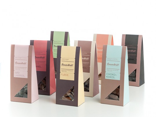
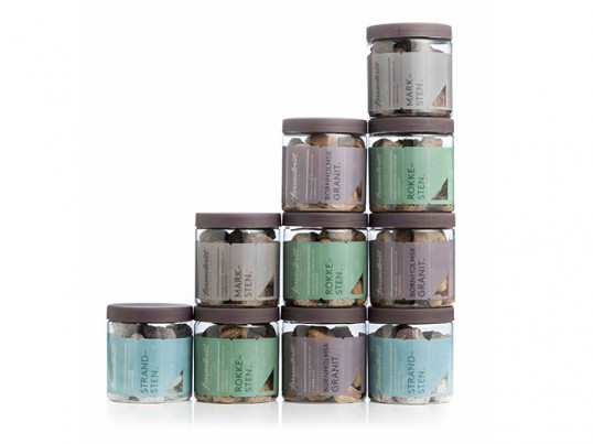
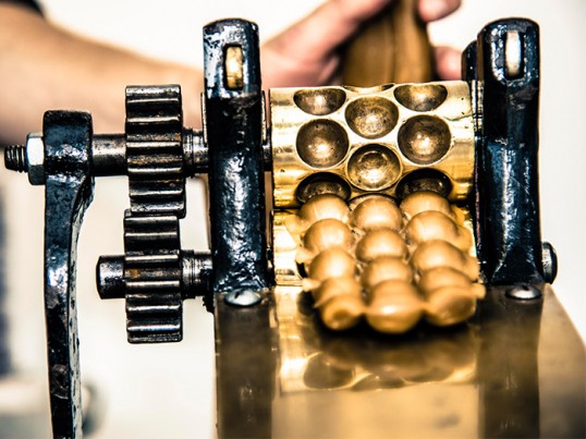
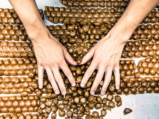
“Karamelleriet is the result of two enthusiasts, a common dream, and a respect for old handcraft. This is reflected in their completely handmade products and personal production. 

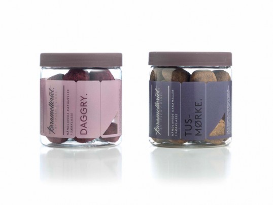
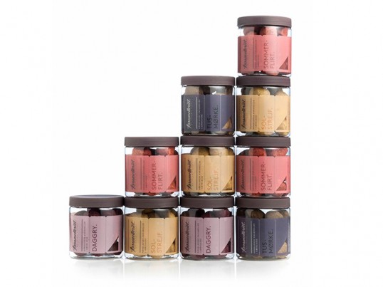
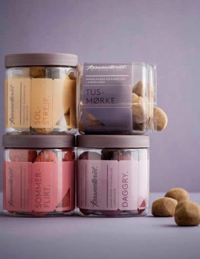
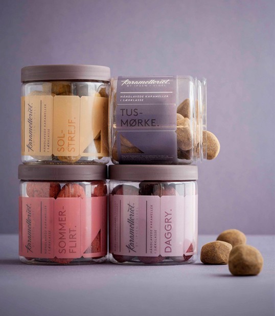
The new visual identity had to reflect these values while at the same time being innovative, and daring to be different. With this Karamelleriet has achieved an expression that their caramel production is the best. 

The design was developed by Bessermachen design studio in close collaboration with Karamelleriet.”

Karamelleriet

Karamelleriet

Karamelleriet

Karamelleriet

Karamelleriet

Karamelleriet

Karamelleriet

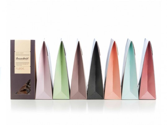
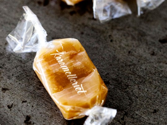
“Inspiration: The entire expression is based on the most essential: the caramel. The contrasting curves which occur during the whole process and the simple and elegant expression the finished caramel has. 

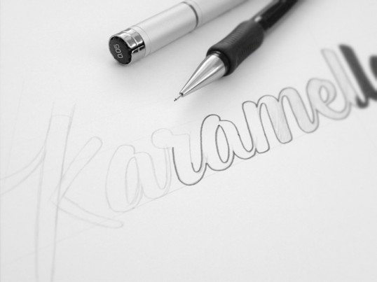
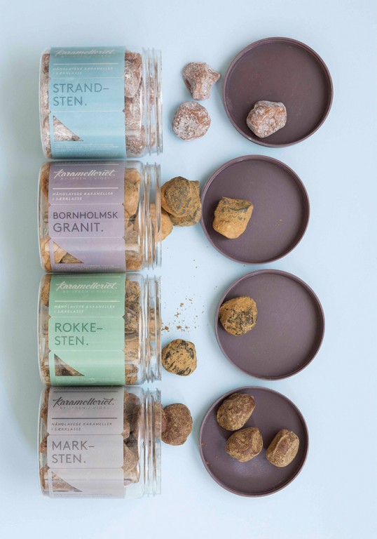
Logo: The first steps were to enclose Karamelleriet and their craft in a logo which is unique and handmade. The caramels soft organic shape and the characteristic lines when it is stretched became the foundation for the hand-drawn logo.”

Karamelleriet

Karamelleriet

Karamelleriet

Karamelleriet

Get the latest packaging design inspiration in your inbox:

Popular designs

Burma Love Rebrand

Love at First BiteAs an extension of the Burma Superstar restaurant in San Francisco, Burma Love Foods gives diners an opportunity to

Pure Persian Honey

When we look closely at honey packaging, they are almost all in the usual format, and the ultimate in creativity is that

The Port Vodka Lemon Water

Overview: In response to my client’s vision for a Cape Cod themed beverage brand, I embarked on the journey to create The Port

Designed by: PepsiCo Design & Innovation
Country: United States

Karamelleriet

lovely-package-karamelleriet-1

Karamelleriet

Designed by Bessermachen | Country: Denmark

“Karamelleriet is the result of two enthusiasts, a common dream, and a respect for old handcraft. This is reflected in their completely handmade products and personal production. 

The new visual identity had to reflect these values while at the same time being innovative, and daring to be different. With this Karamelleriet has achieved an expression that their caramel production is the best. 

The design was developed by Bessermachen design studio in close collaboration with Karamelleriet.”

Karamelleriet

Karamelleriet

Karamelleriet

Karamelleriet

Karamelleriet

Karamelleriet

Karamelleriet

“Inspiration: The entire expression is based on the most essential: the caramel. The contrasting curves which occur during the whole process and the simple and elegant expression the finished caramel has. 

Logo: The first steps were to enclose Karamelleriet and their craft in a logo which is unique and handmade. The caramels soft organic shape and the characteristic lines when it is stretched became the foundation for the hand-drawn logo.”
Karamelleriet

Karamelleriet

Karamelleriet

Karamelleriet

Previous slide
Next slide

Explore more great package design

Get the latest on packaging design in your inbox: