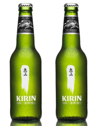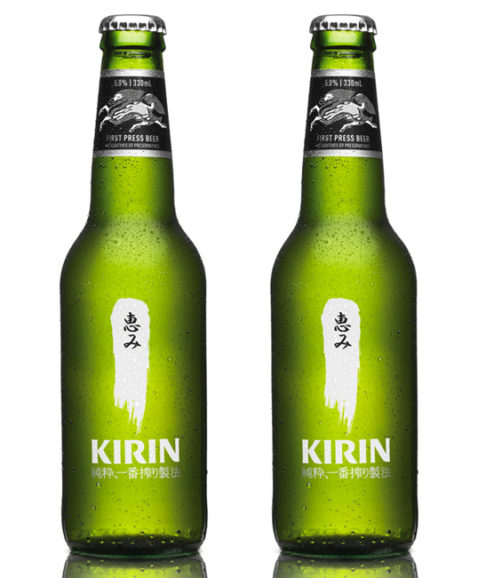
Kirin
January 15, 2010 | 8 Comments
Designed by Di Donato | Country: Australia
“Re-launch of the packaging and identity of the Kirin beer brand in Australia. Client – Lion Nathan.”
Comments
Warning: count(): Parameter must be an array or an object that implements Countable in /nfs/c02/h06/mnt/28959/domains/lovelypackage.com/html/wp-includes/class-wp-comment-query.php on line 399
8 Responses to “Kirin”
Your Comment
January 15th, 2010 @ 7:45 am
It’s somewhat brave to leave so much white space on packing cases. They’ll be covered in rubbing marks by the time they’re transported to customers.
January 15th, 2010 @ 8:39 am
What tranquil-looking beer bottles! But actually, “kanji” means Chinese characters. The Japanese writing system has three scripts, and Chinese characters are one of them.
January 15th, 2010 @ 4:26 pm
“But actually, “kanji” means Chinese characters.”
Anctually, no. The chinese characters are called “hanzi”. Kanji are (simply put) hanzi used to write japanese words. But kanji can differ from hanzi both in the way they are written and in the way they are combined.
January 15th, 2010 @ 4:52 pm
Better to be covered in rub marks than lousy graphics.
January 16th, 2010 @ 5:19 pm
I agree with Larry, rub marks or not, the white design makes a pretty powerful statement. So many of the beer packages out there (and packages in general) are filled with useless graphics that end up cheapening the design.
January 17th, 2010 @ 6:04 pm
it tastes good as well, still quite an important factor to me when I buy beer
January 18th, 2010 @ 9:06 pm
I was curious and looked up the kanji, it means “blessing” or “grace”.
I wondered if they used a calligraphy artist for the brushstroke, it’s cool to know they did.
May 3rd, 2010 @ 12:21 am
Love it!