Designed by: PepsiCo Design & Innovation
Country: United States

Leafs by Snoop

lovely-package-leafs-by-snoop-11

Designed by Pentagram | Country: United States

“Laid-back California cool inspires the branding for a line of marijuana-based products from hip-hop legend Snoop Dogg.

With songs like “Smoke the Weed,” “This Weed Iz Mine,” and “California Roll,” it’s no secret the rapper Snoop Dogg has long been a cannabis connoisseur. Now he’s sharing this passion with the public—at least in Colorado, where consumption is legal—with a new line of marijuana-based products called Leafs By Snoop. Pentagram’s Emily Oberman and team have designed the brand identity and packaging for the line, which includes both flower and edibles (“Dogg Treats”) such as chocolate bars, chews, drops and gummies.”
lovely-package-leafs-by-snoop-10 lovely-package-leafs-by-snoop-9 lovely-package-leafs-by-snoop-2 lovely-package-leafs-by-snoop-6

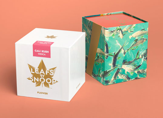
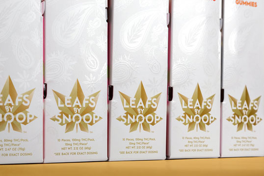
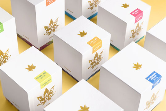
“As the legalization of marijuana gains momentum across the U.S., the category is poised for explosive growth. Working at the forefront of this movement, Snoop and his team wanted to establish a brand that avoided clichés for a more sophisticated image that would still represent fun and a good time. The identity centers on an iconic marijuana leaf playfully constructed of jewel-like facets, accompanied by elegant packaging that is layered with laid-back California cool.

The challenge was creating a brand that captured Snoop’s unique personality and style. At the same time, it was important that it appeal to a broad spectrum of users.”

lovely-package-leafs-by-snoop-12 lovely-package-leafs-by-snoop-4 lovely-package-leafs-by-snoop-14 lovely-package-leafs-by-snoop-13 lovely-package-leafs-by-snoop-3 lovely-package-leafs-by-snoop-8

“Oberman and her team collaborated closely on the project with Ted Chung and Tiffany Chin of Stampede Management, Snoop’s management, as well as Snoop. Oberman has always been a Snoop fan and was thrilled at the chance to work with the hip-hop legend and help launch a brand in a category that is just getting started.

“Snoop is smart, cool and truly unlike anybody else,” she says. “Leafs By Snoop is likewise not just another celebrity-endorsed product. There is nothing artificial about Snoop or LBS. He genuinely loves marijuana and is excited about sharing this enjoyment with others who are able to use it.”

She adds, “We’re definitely pro-marijuana legalization, and we welcomed the opportunity to be involved in the evolution of this issue.”

lovely-package-leafs-by-snoop-7 lovely-package-leafs-by-snoop-5 lovely-package-leafs-by-snoop-1

“For Oberman and the team, the challenge was creating something that captured Snoop’s unique personality and style. At the same time, it was important that the branding appeal to a wide audience. As legalized marijuana moves forward, it is being embraced by a broad spectrum of users, for both recreational and medicinal reasons. Seniors are as likely to use it as are people in their twenties and thirties (the legal age for usage is over 21), and the brand had to feel accessible to beginners and authentic to long-time aficionados alike.

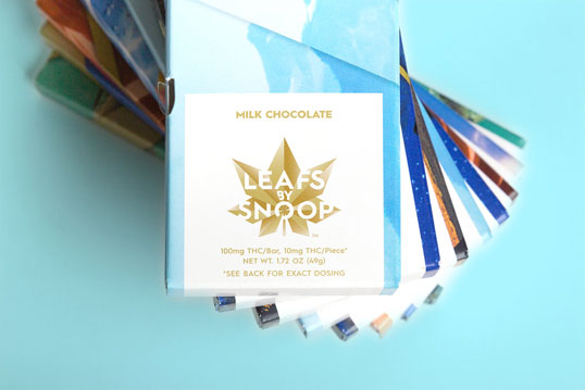
To develop the logo, the team looked at Snoop’s iconography and the visual symbols he identifies with. Snoop has historically been pro marijuana, and was one of the first stars to actively endorse it. Snoop also loves jewelry and fashion, and his brand has evolved in recent years to become very clean and modern. Oberman and her team presented a variety of ideas to Snoop and he gravitated towards pyramids, angles and dimensional facets. The finished Leafs By Snoop logo features a cannabis leaf stylized with jewel-like facets. Iconic and distinctive, the mark gives Snoop his own special leaf. The name “Leafs By Snoop” can also be abbreviated to LBS, a play on weight and buying in bulk. The logo typography is set in the versatile sans serif Hurme Geometric No. 1.

When it came to the packaging, working at the forefront of a new era of recreational products presented a series of challenges. Laws about the packaging of marijuana are still evolving, and the LBS team was on a tight timeline, as they wanted to be one of the first brands out there. The designers used existing packaging structures that were already legally approved, but tweaking it all to make something that felt inventive and high-end.

“It’s like working at the end of Prohibition,” says Oberman. “Everything is changing, all the time. Laws change from week to week, and affect what you can do. It’s incredibly exciting, but it’s also difficult, so we had to keep it simple.”

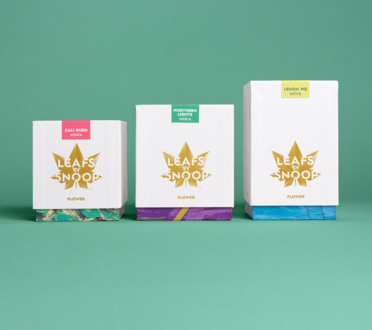
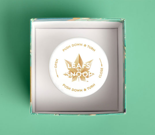
Snoop and his team are extremely responsible regarding usage and didn’t take these considerations lightly; LBS is clearly meant for responsible adults. The minimalism of the white LBS box stylishly satisfies the strict laws about packaging for controlled substances. Marijuana packages have to be opaque and child-proof—the formats are actually tested with children, to make sure they can’t open the boxes. Edibles cannot be called candy but rather gummies, drops and chews. Inside the boxes of weed, the cannabis itself is contained in an opaque white plastic container with a child-proof cap.

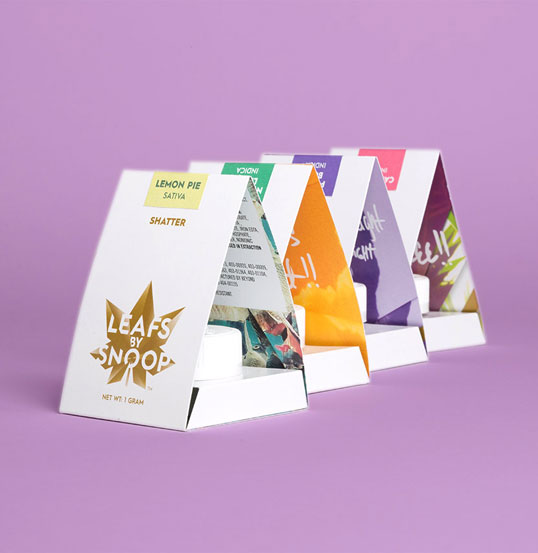
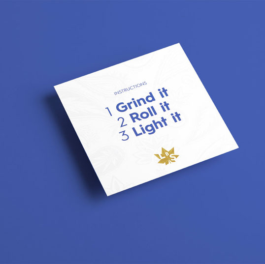
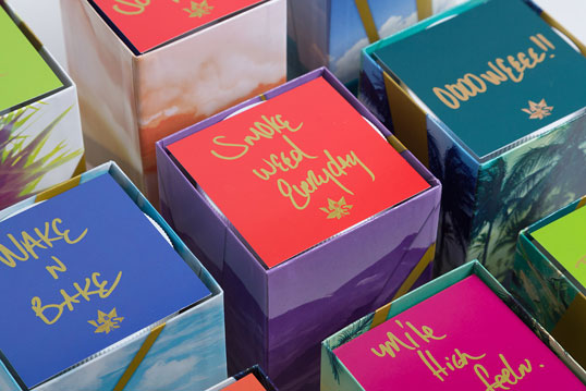
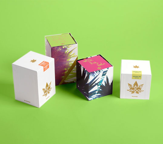
As a forefather of West Coast rap, Snoop is closely associated with California, and this comes into play in the packaging. Clean and simple on the outside, opening the flower boxes reveals a fresh blast of colorful California cool. Sliding off the box cover exposes images of green palms, sunny beaches and blue pools in angled slices that echo the LBS logo. Users encounter other surprises as they handle the packaging: The surface of the outer box is covered with a custom cannabis paisley pattern, printed in a clear, tactile spot varnish. “We chose Paisley because it is one of Snoop’s favorite patterns, borrowed from bandannas,” says Oberman. Opening the box also reveals a colorful collectible sticker featuring a phrase like “Ooouuuweeee” or “Puff puff pass” handwritten by Snoop; the reverse of the sticker features humorous instructions for use the weed.

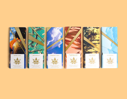
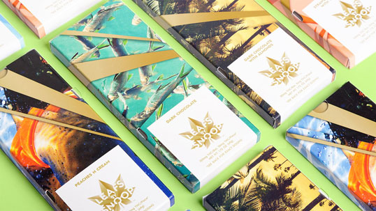
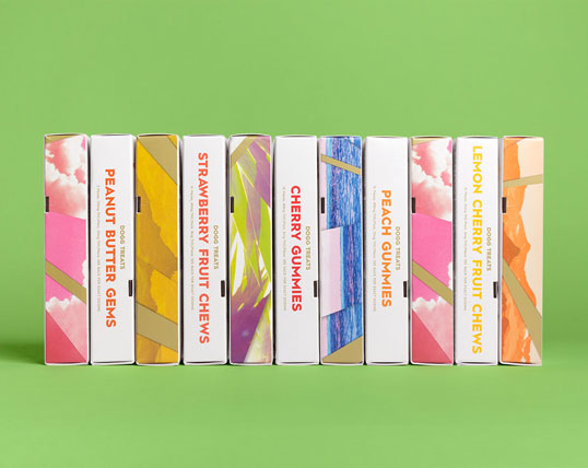
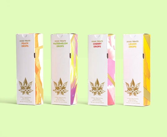
The colorful fractured images and paisley pattern are also integrated into the wrappers of chocolate bars and boxes of gummies, chews and drops. These engaging, playful details help make the LBS packaging feel luxurious and special—and also hopefully contribute to the user’s happy, blissful experience of the product inside.

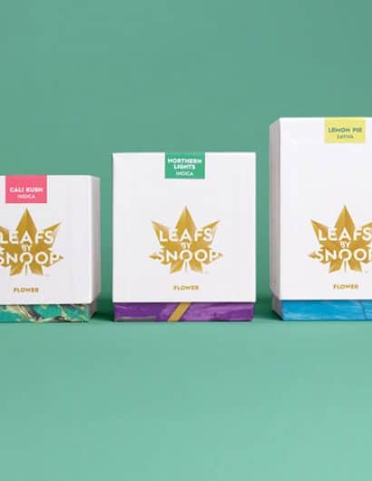
LBS comes in a range of types and flavors, each identified by a different colored sticker. The weed is available in three different sizes—an ounce, an eighth and a quarter—and includes indica and sativa strains in eight different flavors: Blueberry Dream, Bananas, Northern Lights, Lemon Pie, Tangerine Man, 3D CBD, Grape Soda and Cali Kush. The edibles include chocolate bars in six flavors like Peaches N Cream (named after a recent Snoop track) and Strawberries N Cream with Waffle Bits, as well as a variety of “Dogg Treats” (a name the designers helped develop) that encompasses fruit chews and gummies, Watermelon Drops and Peanut Butter Gems.

The fresh, simple look of the packaging carries over to the website, which also features the cannabis paisley pattern, bright color palette, and faceted California photography, as well as images of the LBS packages.

Simultaneous to the Leafs By Snoop project, Oberman and her team also designed the symbol for Merry Jane Media, a new go-to lifestyle resource for all things cannabis. Launched by Snoop and Scott Chung (the brother of Ted Chung, Snoop’s manager) of Cashmere Agency, the website sports the tagline “Cannabis. Culture. For All,” and features video and editorial content that covers everything from industry news and useful information to celebrity interviews, fashion, and a cooking show for pot enthusiasts. One of the site’s most innovative features helps users identify the cannabis strain they want based on their mood—and where they can buy it—with a minimal series of clicks.

The Merry Jane identity echoes some of the look of LBS while standing on its own as a brand. The angled facets of the cannabis leaf have been simplified into a framework of lines that reads as a leaf and suggests a network. The simple symbol works well as an emblem and social media icon, and looked especially great on a gold chain Snoop wore to host the BET Hip Hop Awards earlier this fall.

Working on Leafs By Snoop has been a highlight for Oberman and her team—and not just because of the product. “There was nothing but good vibes and good feelings on this project,” she says. “The process felt really collaborative—we were all figuring it out together. Snoop and his team were awesome, and we love working with them.”

lovely-package-leafs-by-snoop

Get the latest packaging design inspiration in your inbox:

Popular designs

Designed by: PepsiCo Design & Innovation
Country: United States

Leafs by Snoop

lovely-package-leafs-by-snoop-11

lovely-package-leafs-by-snoop-11

Designed by Pentagram | Country: United States

“Laid-back California cool inspires the branding for a line of marijuana-based products from hip-hop legend Snoop Dogg.

With songs like “Smoke the Weed,” “This Weed Iz Mine,” and “California Roll,” it’s no secret the rapper Snoop Dogg has long been a cannabis connoisseur. Now he’s sharing this passion with the public—at least in Colorado, where consumption is legal—with a new line of marijuana-based products called Leafs By Snoop. Pentagram’s Emily Oberman and team have designed the brand identity and packaging for the line, which includes both flower and edibles (“Dogg Treats”) such as chocolate bars, chews, drops and gummies.”
lovely-package-leafs-by-snoop-10 lovely-package-leafs-by-snoop-9 lovely-package-leafs-by-snoop-2 lovely-package-leafs-by-snoop-6

“As the legalization of marijuana gains momentum across the U.S., the category is poised for explosive growth. Working at the forefront of this movement, Snoop and his team wanted to establish a brand that avoided clichés for a more sophisticated image that would still represent fun and a good time. The identity centers on an iconic marijuana leaf playfully constructed of jewel-like facets, accompanied by elegant packaging that is layered with laid-back California cool.

The challenge was creating a brand that captured Snoop’s unique personality and style. At the same time, it was important that it appeal to a broad spectrum of users.”
lovely-package-leafs-by-snoop-12 lovely-package-leafs-by-snoop-4 lovely-package-leafs-by-snoop-14 lovely-package-leafs-by-snoop-13 lovely-package-leafs-by-snoop-3 lovely-package-leafs-by-snoop-8

“Oberman and her team collaborated closely on the project with Ted Chung and Tiffany Chin of Stampede Management, Snoop’s management, as well as Snoop. Oberman has always been a Snoop fan and was thrilled at the chance to work with the hip-hop legend and help launch a brand in a category that is just getting started.

“Snoop is smart, cool and truly unlike anybody else,” she says. “Leafs By Snoop is likewise not just another celebrity-endorsed product. There is nothing artificial about Snoop or LBS. He genuinely loves marijuana and is excited about sharing this enjoyment with others who are able to use it.”

She adds, “We’re definitely pro-marijuana legalization, and we welcomed the opportunity to be involved in the evolution of this issue.”
lovely-package-leafs-by-snoop-7 lovely-package-leafs-by-snoop-5 lovely-package-leafs-by-snoop-1

“For Oberman and the team, the challenge was creating something that captured Snoop’s unique personality and style. At the same time, it was important that the branding appeal to a wide audience. As legalized marijuana moves forward, it is being embraced by a broad spectrum of users, for both recreational and medicinal reasons. Seniors are as likely to use it as are people in their twenties and thirties (the legal age for usage is over 21), and the brand had to feel accessible to beginners and authentic to long-time aficionados alike.

To develop the logo, the team looked at Snoop’s iconography and the visual symbols he identifies with. Snoop has historically been pro marijuana, and was one of the first stars to actively endorse it. Snoop also loves jewelry and fashion, and his brand has evolved in recent years to become very clean and modern. Oberman and her team presented a variety of ideas to Snoop and he gravitated towards pyramids, angles and dimensional facets. The finished Leafs By Snoop logo features a cannabis leaf stylized with jewel-like facets. Iconic and distinctive, the mark gives Snoop his own special leaf. The name “Leafs By Snoop” can also be abbreviated to LBS, a play on weight and buying in bulk. The logo typography is set in the versatile sans serif Hurme Geometric No. 1.

When it came to the packaging, working at the forefront of a new era of recreational products presented a series of challenges. Laws about the packaging of marijuana are still evolving, and the LBS team was on a tight timeline, as they wanted to be one of the first brands out there. The designers used existing packaging structures that were already legally approved, but tweaking it all to make something that felt inventive and high-end.

“It’s like working at the end of Prohibition,” says Oberman. “Everything is changing, all the time. Laws change from week to week, and affect what you can do. It’s incredibly exciting, but it’s also difficult, so we had to keep it simple.”

Snoop and his team are extremely responsible regarding usage and didn’t take these considerations lightly; LBS is clearly meant for responsible adults. The minimalism of the white LBS box stylishly satisfies the strict laws about packaging for controlled substances. Marijuana packages have to be opaque and child-proof—the formats are actually tested with children, to make sure they can’t open the boxes. Edibles cannot be called candy but rather gummies, drops and chews. Inside the boxes of weed, the cannabis itself is contained in an opaque white plastic container with a child-proof cap.

As a forefather of West Coast rap, Snoop is closely associated with California, and this comes into play in the packaging. Clean and simple on the outside, opening the flower boxes reveals a fresh blast of colorful California cool. Sliding off the box cover exposes images of green palms, sunny beaches and blue pools in angled slices that echo the LBS logo. Users encounter other surprises as they handle the packaging: The surface of the outer box is covered with a custom cannabis paisley pattern, printed in a clear, tactile spot varnish. “We chose Paisley because it is one of Snoop’s favorite patterns, borrowed from bandannas,” says Oberman. Opening the box also reveals a colorful collectible sticker featuring a phrase like “Ooouuuweeee” or “Puff puff pass” handwritten by Snoop; the reverse of the sticker features humorous instructions for use the weed.

The colorful fractured images and paisley pattern are also integrated into the wrappers of chocolate bars and boxes of gummies, chews and drops. These engaging, playful details help make the LBS packaging feel luxurious and special—and also hopefully contribute to the user’s happy, blissful experience of the product inside.

LBS comes in a range of types and flavors, each identified by a different colored sticker. The weed is available in three different sizes—an ounce, an eighth and a quarter—and includes indica and sativa strains in eight different flavors: Blueberry Dream, Bananas, Northern Lights, Lemon Pie, Tangerine Man, 3D CBD, Grape Soda and Cali Kush. The edibles include chocolate bars in six flavors like Peaches N Cream (named after a recent Snoop track) and Strawberries N Cream with Waffle Bits, as well as a variety of “Dogg Treats” (a name the designers helped develop) that encompasses fruit chews and gummies, Watermelon Drops and Peanut Butter Gems.

The fresh, simple look of the packaging carries over to the website, which also features the cannabis paisley pattern, bright color palette, and faceted California photography, as well as images of the LBS packages.

Simultaneous to the Leafs By Snoop project, Oberman and her team also designed the symbol for Merry Jane Media, a new go-to lifestyle resource for all things cannabis. Launched by Snoop and Scott Chung (the brother of Ted Chung, Snoop’s manager) of Cashmere Agency, the website sports the tagline “Cannabis. Culture. For All,” and features video and editorial content that covers everything from industry news and useful information to celebrity interviews, fashion, and a cooking show for pot enthusiasts. One of the site’s most innovative features helps users identify the cannabis strain they want based on their mood—and where they can buy it—with a minimal series of clicks.

The Merry Jane identity echoes some of the look of LBS while standing on its own as a brand. The angled facets of the cannabis leaf have been simplified into a framework of lines that reads as a leaf and suggests a network. The simple symbol works well as an emblem and social media icon, and looked especially great on a gold chain Snoop wore to host the BET Hip Hop Awards earlier this fall.

Working on Leafs By Snoop has been a highlight for Oberman and her team—and not just because of the product. “There was nothing but good vibes and good feelings on this project,” she says. “The process felt really collaborative—we were all figuring it out together. Snoop and his team were awesome, and we love working with them.”

lovely-package-leafs-by-snoop

Previous slide
Next slide
Get the latest on packaging design in your inbox: