Designed by: PepsiCo Design & Innovation
Country: United States

Lervig 10th Anniversary

Lervig 10th Anniversary

Designed by Daniel Brokstad | Country: Norway

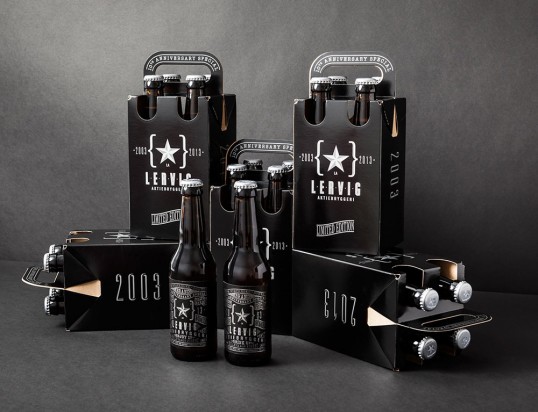
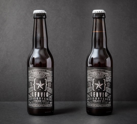
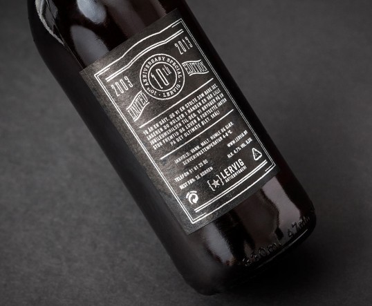
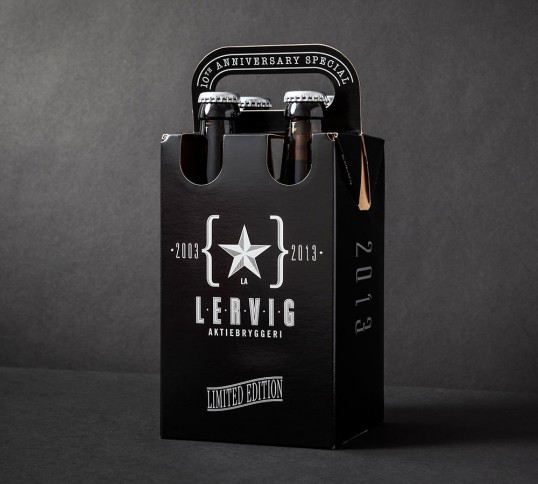
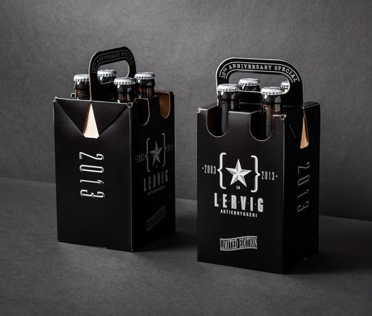
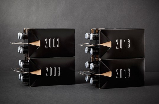
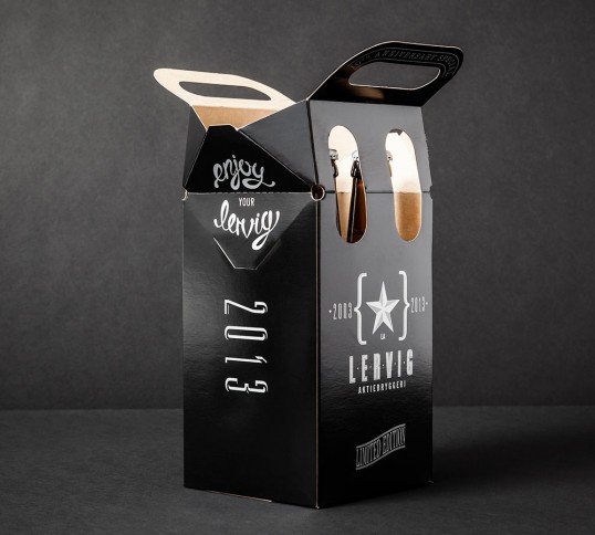
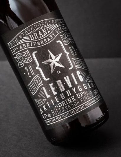
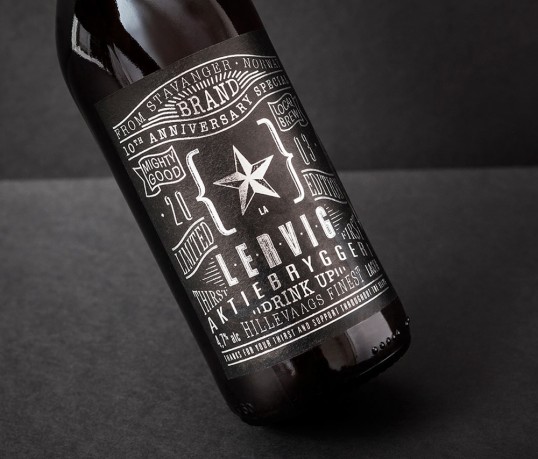
“Lervig started their brewery back in 2003, and now as it’s their 10th anniversary they decided to make a limited edition beer as a celebration, only sold directly at the brewery. The design tells the story of how it started with key words that changed from where they started and where they are now through a typography solution, that falls in similar old style category as the design style of their previous beers. The four pack consisted of 2 of each 2003 and 2013 editions and a little surprise as you open it you’re welcomed with “Enjoy your lervig” written under the closing mechanism. The design was printed as silver on pure black to emphasise both the exclusivity of the limited edition beer and a suitable combination for their anniversary.”

Lervig 10th Anniversary

Lervig 10th Anniversary

Lervig 10th Anniversary

Lervig 10th Anniversary

Lervig 10th Anniversary

Lervig 10th Anniversary

Lervig 10th Anniversary

Lervig 10th Anniversary

Get the latest packaging design inspiration in your inbox:

Popular designs

Far Out Bar

Description: Far Out Bar is a cutting-edge packaging design project created for High Life Farms’ macrodose THC chocolate bars. This project involved

Pure Persian Honey

When we look closely at honey packaging, they are almost all in the usual format, and the ultimate in creativity is that

Burma Love Rebrand

Love at First BiteAs an extension of the Burma Superstar restaurant in San Francisco, Burma Love Foods gives diners an opportunity to

Designed by: PepsiCo Design & Innovation
Country: United States

Lervig 10th Anniversary

lovely-package-lervig-1

Lervig 10th Anniversary

Designed by Daniel Brokstad | Country: Norway

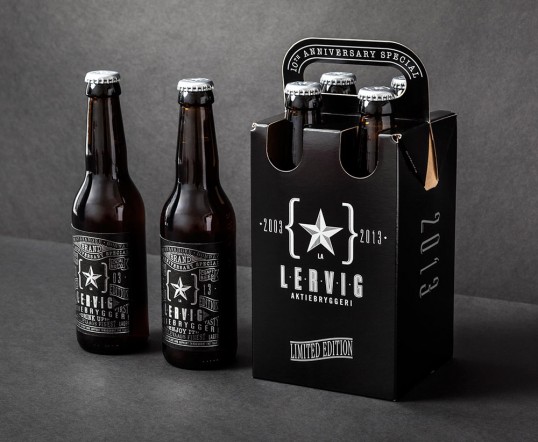
“Lervig started their brewery back in 2003, and now as it’s their 10th anniversary they decided to make a limited edition beer as a celebration, only sold directly at the brewery. The design tells the story of how it started with key words that changed from where they started and where they are now through a typography solution, that falls in similar old style category as the design style of their previous beers. The four pack consisted of 2 of each 2003 and 2013 editions and a little surprise as you open it you’re welcomed with “Enjoy your lervig” written under the closing mechanism. The design was printed as silver on pure black to emphasise both the exclusivity of the limited edition beer and a suitable combination for their anniversary.”
Lervig 10th Anniversary

Lervig 10th Anniversary

Lervig 10th Anniversary

Lervig 10th Anniversary

Lervig 10th Anniversary

Lervig 10th Anniversary

Lervig 10th Anniversary

Lervig 10th Anniversary

Previous slide
Next slide

Explore more great package design

Get the latest on packaging design in your inbox: