Designed by: PepsiCo Design & Innovation
Country: United States

LH2O

1

pedrita1

Designed by Pedrita | Country: Portugal

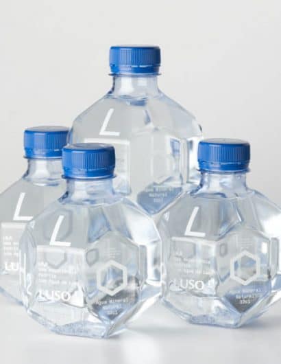
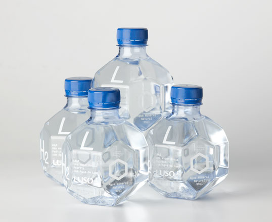
LH2O is a research project on a new form for Água de Luso (Luso water) and the result of a collaboration between Pedrita studio and the Luso brand. This project aims to find not only a new form for this liquid, but also to come up with a bottle that illustrates the qualities and unique properties of Água de Luso, which has been part of the life and body of the Portuguese for over 150 years. That’s what made us – naturally – add a new element to the chemical formula of water, redesigning the way we see, read and know Água de Luso.

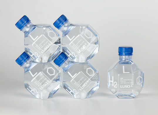
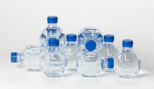
This bottle’s shape results from an application of space-filling scientific models to packaging design. Found in rock formations, plants and other cellular structures, these models can also be generated by mathematical and geometrical calculations. The elementary form of LH2O results from the intersection of two geometric solids: a simple cube (bottle neck and cap) and a truncated cube (package). The main volume’s 17 faces – five square and 12 hexagonal, identical faces – allow for an endless number of bottles to be regularly grouped together in several configurations that suppress empty space between them. Each of these “three-dimensional space-filling modules” significantly optimizes the processes of storage and transportation, reduces the amount of material (Polyethylene Terephthalate, or PET) used in the bottle and creates a greater impact in the final product’s display. Viewed as part of a whole, every bottle thus enables the creation of display solutions – be it at point of sale or in other consumption contexts – based on unexpected, three-dimensional arrangements.
pedrita2

pedrita3

1

Get the latest packaging design inspiration in your inbox:

Popular designs

The Bra Guru

Most women are wearing the wrong size bra and that is a fact. The Bra Guru® is the first and only professional

Far Out Bar

Description: Far Out Bar is a cutting-edge packaging design project created for High Life Farms’ macrodose THC chocolate bars. This project involved

Designed by: PepsiCo Design & Innovation
Country: United States

LH2O

1
pedrita1

pedrita1

Designed by Pedrita | Country: Portugal

LH2O is a research project on a new form for Água de Luso (Luso water) and the result of a collaboration between Pedrita studio and the Luso brand. This project aims to find not only a new form for this liquid, but also to come up with a bottle that illustrates the qualities and unique properties of Água de Luso, which has been part of the life and body of the Portuguese for over 150 years. That’s what made us – naturally – add a new element to the chemical formula of water, redesigning the way we see, read and know Água de Luso.

This bottle’s shape results from an application of space-filling scientific models to packaging design. Found in rock formations, plants and other cellular structures, these models can also be generated by mathematical and geometrical calculations. The elementary form of LH2O results from the intersection of two geometric solids: a simple cube (bottle neck and cap) and a truncated cube (package). The main volume’s 17 faces – five square and 12 hexagonal, identical faces – allow for an endless number of bottles to be regularly grouped together in several configurations that suppress empty space between them. Each of these “three-dimensional space-filling modules” significantly optimizes the processes of storage and transportation, reduces the amount of material (Polyethylene Terephthalate, or PET) used in the bottle and creates a greater impact in the final product’s display. Viewed as part of a whole, every bottle thus enables the creation of display solutions – be it at point of sale or in other consumption contexts – based on unexpected, three-dimensional arrangements.

pedrita2

pedrita3

1
Previous slide
Next slide

Explore more great package design

Get the latest on packaging design in your inbox: