Designed by by north™ | Country: Norway
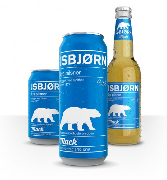
“In February 2014 Mack Isbjørn is back on the shelves after being away since 2007. This is the first project by north™ has taken on for Macks Ølbryggeri, the worlds northernmost brewery. The goal for Isbjørn is to establish it as a competitor to products like Tuborg pilsener and Ringnes pilsener who today dominate the lower price-bracet in the beer-category in Norway, and to recruit new customers to Mack.
The design lends it’s language from Swiss Modernism and challenges the traditional beer-design seen in the category, which makes it stand out on the shelf with great impact both in graphic language and use of color.”