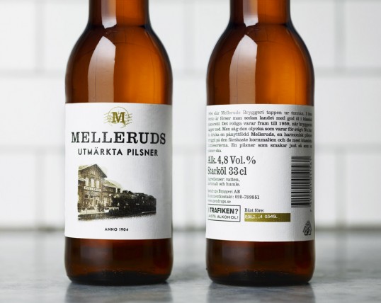
Designed by Neumeister | Country: Sweden
“Whoever said you can’t recreate the past, apparently never told Spendrups master brewer, Richard Bengtsson. Inspired by archives and a fascination with historical brewing techniques, Bengtsson did just that, re-launching a Swedish classic that hadn’t been around for over 50 years. Although Melleruds brewery is long gone, we wanted to respect the rebirth of its prized pilsner with a design language that presents the nostalgia and unvarnished aesthetic of the 1940s in a way that is current and inviting. Everything from the logotype to label design and packaging takes you back to a time when simplicity trumped sophistication, colour was a fad, and the words ‘ordinary’ and ‘traditional’ were considered high praise. Fast-forward to the present and you’ve got design that gets noticed, because it is honest. That stays fresh, because it is authentic. The perfect dressing for a beer Bengtsson considers “just as it should be.”