Designed by Clase BCN | Country: Spain
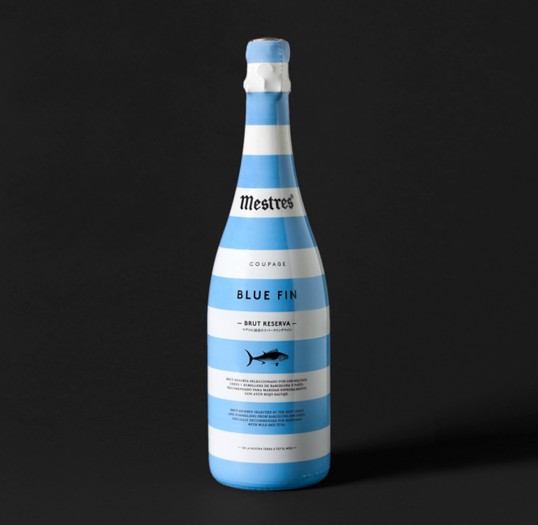
“The blue fin is a kind of tuna. Mestres Coupage Blue Fin is a cava that has been specially created to go with this superb fish and also to raise a toast to all the fishermen, chefs and salespeople whose work is based around it.
The commission came with an explicit request by the client to use a plastic sleeve as the label for a bottle of premium cava—not an easy starting point given that this material is usually linked to mass consumer goods.
However, we embraced this request as a positive challenge to fill the bottle with a graphic design that would make it highly visible and easily recognisable on a sales display.
The artwork reflects its seafaring spirit, wrapping the bottle with a direct, easily recognisable graphic design. The typeface strikes a contrast with the pop pattern, giving the final result a serious, elegant touch in keeping with a premium product.”