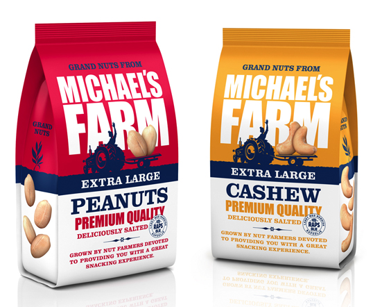
Designed by Strømme Throndsen Design | Country: Norway
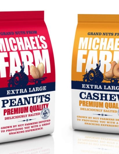
“This is the redesign of Michael’s Farm extra large nuts, designed by Strømme Throndsen Design in Norway. I’ve also attached the old one so you can see the difference.”
Designed by Strømme Throndsen Design | Country: Norway
“This is the redesign of Michael’s Farm extra large nuts, designed by Strømme Throndsen Design in Norway. I’ve also attached the old one so you can see the difference.”

Get the latest packaging design inspiration in your inbox:
Designed by: PepsiCo Design & Innovation
Country: United States

Designed by Strømme Throndsen Design | Country: Norway
“This is the redesign of Michael’s Farm extra large nuts, designed by Strømme Throndsen Design in Norway. I’ve also attached the old one so you can see the difference.”

