Designed by: PepsiCo Design & Innovation
Country: United States

Mii

Mii

Designed by Pearlfisher | Country: United Kingdom

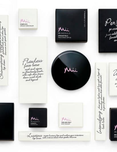
“Pearlfisher has created the branding for Mii, a make-up line from Gerrard International – the first own-brand make-up line from this leading consultancy and distributor for professional beauty salons and spas. Mii offers an exciting choice of everyday make-up essentials with a professional quality that is not directed soley by colour trends and fashion fads.

Appointed in 2009 on the strength of its beauty brand credentials, Pearlfisher was tasked with creating brand strategy, product segmentation, naming, tone of voice and the packaging design.

The brand essence revolves around the idea of ultimate individuality. The consumer is at the heart of the brand and the products work to enhance and define the individual beauty – the real ‘me’ – of those that use them. The brand name is an aural representation of the brand essence and looks unique and stylish when written.

To help simplify, stand out and educate in the cosmetic marketplace, the graphic design is led by copy & tone of voice with useful hints and tips on how best to use the Mii products to suit the individual. The colour scheme reflects the premium and professional quality of the brand.

Natalie Chung, Creative Director Pearlfisher says “Mii appeals to both the professional market and the non-professional consumer. The design portrays the quality and educational aspect of the brand whilst also giving Mii a completely ownable and chic look and feel”.

Get the latest packaging design inspiration in your inbox:

Popular designs

Designed by: PepsiCo Design & Innovation
Country: United States

Mii

mii1

Mii

Designed by Pearlfisher | Country: United Kingdom

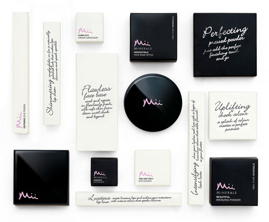
“Pearlfisher has created the branding for Mii, a make-up line from Gerrard International – the first own-brand make-up line from this leading consultancy and distributor for professional beauty salons and spas. Mii offers an exciting choice of everyday make-up essentials with a professional quality that is not directed soley by colour trends and fashion fads.

Appointed in 2009 on the strength of its beauty brand credentials, Pearlfisher was tasked with creating brand strategy, product segmentation, naming, tone of voice and the packaging design.

The brand essence revolves around the idea of ultimate individuality. The consumer is at the heart of the brand and the products work to enhance and define the individual beauty – the real ‘me’ – of those that use them. The brand name is an aural representation of the brand essence and looks unique and stylish when written.

To help simplify, stand out and educate in the cosmetic marketplace, the graphic design is led by copy & tone of voice with useful hints and tips on how best to use the Mii products to suit the individual. The colour scheme reflects the premium and professional quality of the brand.

Natalie Chung, Creative Director Pearlfisher says “Mii appeals to both the professional market and the non-professional consumer. The design portrays the quality and educational aspect of the brand whilst also giving Mii a completely ownable and chic look and feel”.

Explore more great package design

Get the latest on packaging design in your inbox: