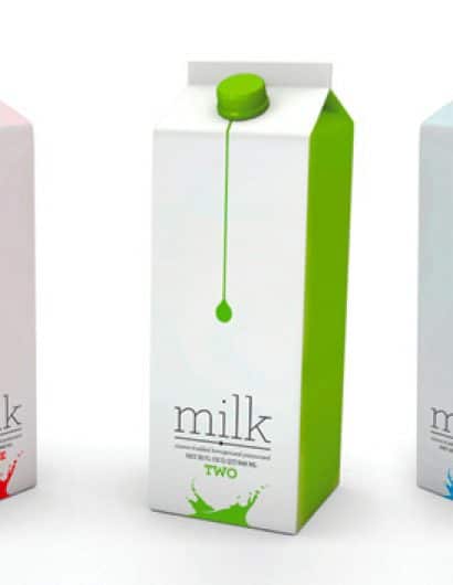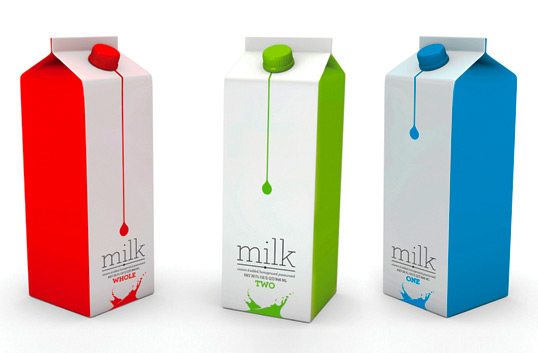
Milk Concept
March 14, 2009 | 23 Comments
Designed by David Fung | Country: United States | Fonts used: Archer
“This was a personal experiment in form, function, and fun. The goal of this redesign was to use a standard milk carton as the canvas to create a clean, modern, and functional design yet still approachable for the average consumer.”
Comments
Warning: count(): Parameter must be an array or an object that implements Countable in /nfs/c02/h06/mnt/28959/domains/lovelypackage.com/html/wp-includes/class-wp-comment-query.php on line 399
23 Responses to “Milk Concept”
Your Comment
March 14th, 2009 @ 12:05 pm
That’s awesome. Easily the best looking milk carton’s ever. Adds so much life to the carton. Now just to convince a company to run with this?
March 14th, 2009 @ 1:04 pm
Very neat. I really like this concept! Better than the boring cartons we have now.
March 14th, 2009 @ 1:48 pm
Sorry, what makes this better than Tropicana’s horrific redesign? I realize it’s just a concept but there’s nothing about this that would make me want to buy this milk.
I’m all for “clean” designs, but this takes generic to a new level.
March 14th, 2009 @ 2:26 pm
I like the concept, however with milk being white I might have been tempted to reverse the colours so the milk drip and splash are white.
March 16th, 2009 @ 10:11 am
I agree with Abbas! I still think this brand has the best packaging: http://www.schroedermilk.com/
March 16th, 2009 @ 12:36 pm
I like this concept, it grabs my attention.
March 23rd, 2009 @ 6:22 am
very nice concept I like..
March 23rd, 2009 @ 7:08 am
I have to agree, if the colours were reversed the white milk ‘droplet’ would be instantly recognisable. Nice use of colours though, would provide strong shelf standout (or should that be fridge standout?).
March 23rd, 2009 @ 8:46 am
I really like this. Minimalist approach yet very memorable. Good job.
April 11th, 2009 @ 1:24 pm
Design-wise, I don’t think there’s anything “generic” about this. It’s simple yet attractive &, more importantly, relevant & effective. Sure, it may seem “minimalist”, which is what many consumers like but generic? I don’t think so.
April 24th, 2009 @ 2:35 pm
I think there should be pastel colors instead of the bright ones. It seems a bit anti-milk. Besides that, great design.
June 1st, 2009 @ 8:50 pm
i love it…can you make it happen for real?
June 6th, 2009 @ 4:59 pm
its a milk carton…..nobody cares..
June 15th, 2009 @ 12:40 pm
i care. i think it’s lovely!
June 17th, 2009 @ 5:28 pm
Wow, that looks absolutely delicious! You did a great job presenting the pictures too, I will definitely have to try this recipe when I have some time this weekend
July 19th, 2009 @ 5:48 pm
very simple. i love it>_<
July 26th, 2009 @ 5:25 pm
LOVE IT!!!!
September 1st, 2011 @ 11:56 pm
“reality check”, are you for real?
With approximately 7.5 million households in Australia-wide for example, and say the average household buys 1 carton of milk a week, a company can potentially sell 390,000,000 cartons of milk a year. Even if they sell it at $1, that’s $390,000,000 up for grabs. Do you really think nobody cares?
October 1st, 2011 @ 4:48 pm
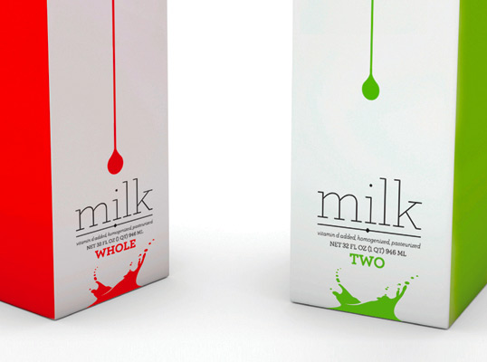
great one design! but,, what’s the difference between “whole”, “one”, and “two”? O.o *still don’t understand*
October 3rd, 2011 @ 1:50 pm
Fabulous design – gorgeous. the difference between whole, one and two is the %fat.
April 19th, 2012 @ 12:16 pm
It is 2012 now. Have they made these milk cartons now instead of keeping them concept?? Thank you. Christina
August 2nd, 2012 @ 8:38 am
Hi David,
I’m developing a mobile application. Could I use the image as a sample product in the App Screenshots in Google Play?
Thanks & Regards
Wai
April 15th, 2013 @ 1:17 pm
Great concept. I’ve presented the image at my blog. Hope you don’t mind.