Designed by: PepsiCo Design & Innovation
Country: United States

Mleko i Miód

Mleko i Miód

Designed by Beza Project | Country: Poland

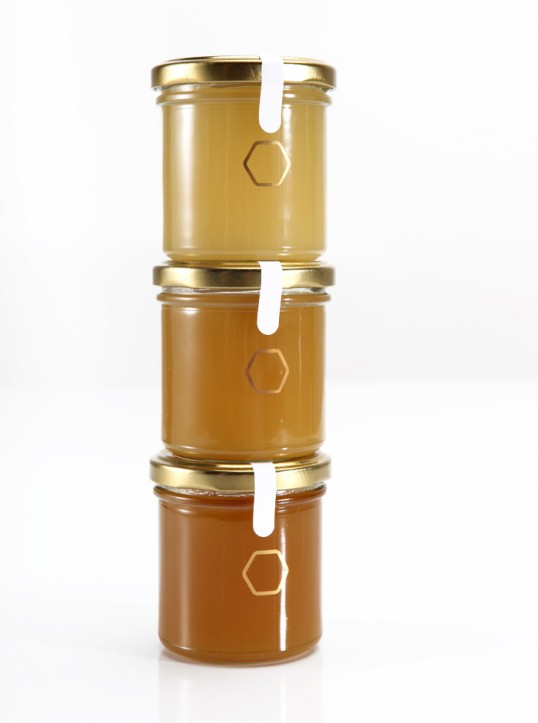
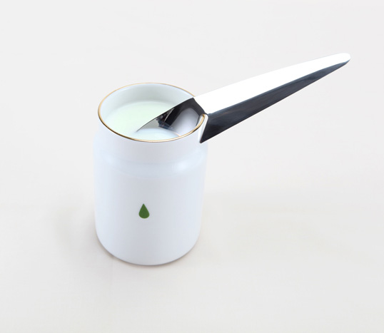
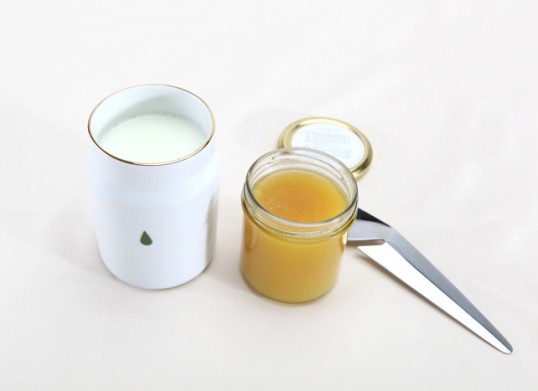
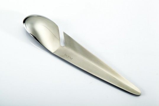
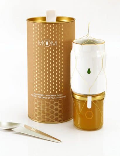
“Mleko i Miód” (Milk&Honey) was designed for the Ministry of Foreign Affairs as a gift for the Polish EU Presidency. It is a set for preparing a traditional drink. Our studio delivered a turn key solution – from the initial concept design to full coordination and project management at the production level. It consists of a porcelain cup, spoon and a jar of Polish honey. The shape of each element and graphic design were inspired by motifs originating from Polish culture and tradition. The mug was sculpted to resemble a traditional milk can and the spoon is shaped like a quill pen – a nod to the poetic provenance of the term “a land flowing with milk and honey”. The detailed recipe for ”Milk&Honey” can be found inside the box.”

Mleko i Miód

Mleko i Miód

Mleko i Miód

Mleko i Miód

Mleko i Miód

Get the latest packaging design inspiration in your inbox:

Popular designs

Far Out Bar

Description: Far Out Bar is a cutting-edge packaging design project created for High Life Farms’ macrodose THC chocolate bars. This project involved

Over the wave

This Kombucha originates in Lombok, Indonesia, where its paradise beaches attract hundreds of surfers eager to ride the waves. When you surf,

The Port Vodka Lemon Water

Overview: In response to my client’s vision for a Cape Cod themed beverage brand, I embarked on the journey to create The Port

Designed by: PepsiCo Design & Innovation
Country: United States

Mleko i Miód

lovely-package-m&m1

Mleko i Miód

Designed by Beza Project | Country: Poland

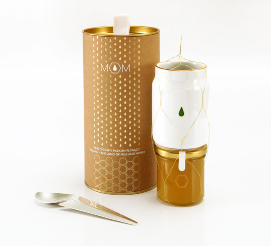
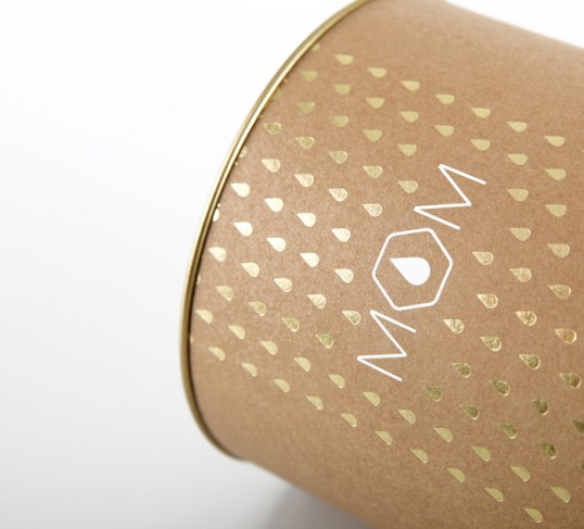
“Mleko i Miód” (Milk&Honey) was designed for the Ministry of Foreign Affairs as a gift for the Polish EU Presidency. It is a set for preparing a traditional drink. Our studio delivered a turn key solution – from the initial concept design to full coordination and project management at the production level. It consists of a porcelain cup, spoon and a jar of Polish honey. The shape of each element and graphic design were inspired by motifs originating from Polish culture and tradition. The mug was sculpted to resemble a traditional milk can and the spoon is shaped like a quill pen – a nod to the poetic provenance of the term “a land flowing with milk and honey”. The detailed recipe for ”Milk&Honey” can be found inside the box.”
Mleko i Miód

Mleko i Miód

Mleko i Miód

Mleko i Miód

Mleko i Miód

Previous slide
Next slide

Explore more great package design

Get the latest on packaging design in your inbox: