Nijenrode
January 16, 2012 | 6 Comments
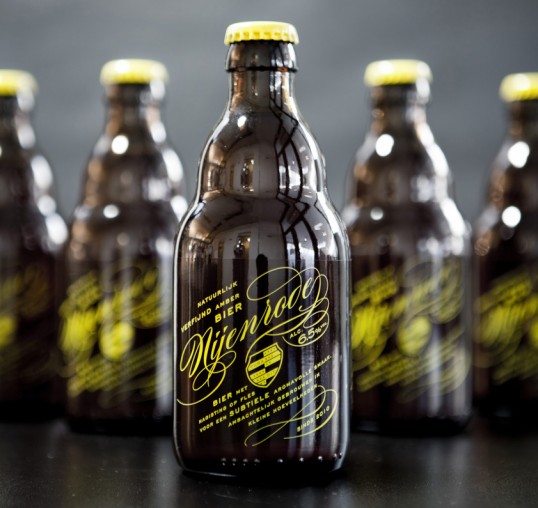
Designed by Redthumb | Country: The Netherlands
“A hand-crafted beer brewed in small batches in The Netherlands, Nijenrode is a much loved local secret amongst graduates from the Nijenrode University. Redthumb was asked to create a powerful brand identity and label that reflected the elite status of Nijenrode (without taking itself too seriously), yet was down-to-earth, and simple to produce. The label is single colour, making it straightforward and pure, and also providing the brand it’s own identity colour.”
Comments
6 Responses to “Nijenrode”
Your Comment


January 16th, 2012 @ 9:55 pm
Looks just like Stumptown Coffee Roasters Cold Brew!!!!!!
What a %^*+’n rip off!!!!!
These ‘design’ students should be ashamed of themselves!
HACKS!
January 17th, 2012 @ 10:40 pm
Gorgeous type.
January 17th, 2012 @ 11:48 pm
Why thank you Jeremy for your elegant reaction. In a world of packaging there may always be similarities – especially to the untrained eye. Yes, after searching for your referenced coffee bottle, the both appear to use yellow on a dark bottle, amazing. I’m afraid here in Holland we won’t check for every bottle in every category in every country for similarities, and even then the design is not a ‘xxxxx rip-off’. Oh, and I’m not a student, I am an award winning designer with over 25 years experience, having been creative director at europes largest independent branding agency. ‘Europe’ – google it some time. After you’ve googled ‘branding’.
January 20th, 2012 @ 12:24 am
guys get a room
January 23rd, 2012 @ 1:28 pm
Nice job, but to be honest, the Photography bothers me.
February 5th, 2012 @ 10:05 pm
Love the script and the bottle selection is awesome. I love the short bottle shape. Great Work.