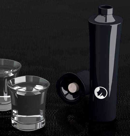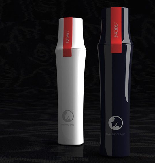
Designed by ChappsMalina | Country: United States
Using bamboo as inspiration, ChappsMalina created this beautiful and unique structural design for the world famous Nobu Japanese Restaurant.

Designed by: PepsiCo Design & Innovation
Country: United States

Designed by ChappsMalina | Country: United States
Using bamboo as inspiration, ChappsMalina created this beautiful and unique structural design for the world famous Nobu Japanese Restaurant.


Get the latest packaging design inspiration in your inbox:
Designed by: PepsiCo Design & Innovation
Country: United States
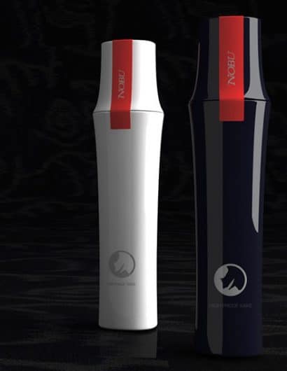

Designed by ChappsMalina | Country: United States
Using bamboo as inspiration, ChappsMalina created this beautiful and unique structural design for the world famous Nobu Japanese Restaurant.
