Designed by: PepsiCo Design & Innovation
Country: United States

Nuun

Nuun

Designed by Creature | Country: United States

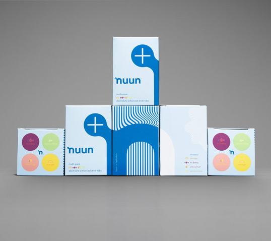
Creature, the Seattle and London-based international creative agency has revamped a suite of brand visuals for sports hydration brand, Nuun.

Hot on the heels of its work rebranding Starbuck’s-owned, Seattle’s Best Coffee, Creature was tasked with evolving Nuun’s visual identity to increase appeal on- and offline. Nuun aims to reach a broader demographic of professional, amateur, and aspiring athletes, inviting new users without losing credibility with core customers. The re-brand marks a departure away from the science-heavy nature of the category.

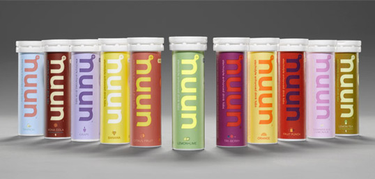
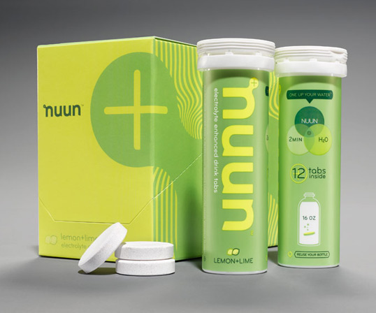
The brand’s new eye-catching design complements the energy and vitality of Nuun’s ‘advanced hydration’ proposition. Creature capitalized on the high-energy spirit of the brand, taking its inspiration from Nuun’s popular range of electrolyte-enhanced drinks tablets and diverse flavour range, including Tri-Berry, Orange and Citrus Fruit.

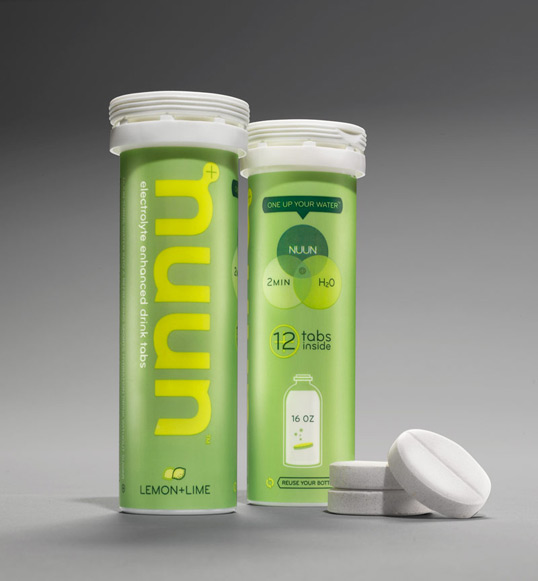
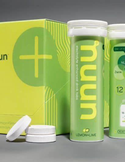
Creature created a bespoke typeface for the new Nuun logo, designed to be distinctive, clear, yet individual. The logo takes has pride of place across Nuun’s signature tube packaging in a variety of contrasting and complementary colors. Content instructions are also brought to life using graphic elements, alongside the Nuun strapline ‘One Up Your Water.’

Steve Cullen, design director at Creature said: “Nuun has the guts to make a 180-degree departure from how the category does things. So far the response from loyalist and new users has been very positive. We’ve paid close attention to total integration, every piece plays a part in the story—from how they speak, to preserving their brand DNA, to their use of community building, to e-commerce. Massive brand evolutions like this are our favorite projects to tackle.”

Nuun

Nuun

Nuun

Nuun

Get the latest packaging design inspiration in your inbox:

Popular designs

Designed by: PepsiCo Design & Innovation
Country: United States

Nuun

nuun1

Nuun

Designed by Creature | Country: United States

Creature, the Seattle and London-based international creative agency has revamped a suite of brand visuals for sports hydration brand, Nuun.

Hot on the heels of its work rebranding Starbuck’s-owned, Seattle’s Best Coffee, Creature was tasked with evolving Nuun’s visual identity to increase appeal on- and offline. Nuun aims to reach a broader demographic of professional, amateur, and aspiring athletes, inviting new users without losing credibility with core customers. The re-brand marks a departure away from the science-heavy nature of the category.

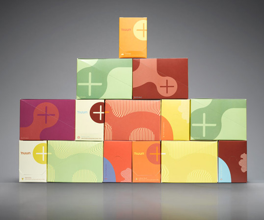
The brand’s new eye-catching design complements the energy and vitality of Nuun’s ‘advanced hydration’ proposition. Creature capitalized on the high-energy spirit of the brand, taking its inspiration from Nuun’s popular range of electrolyte-enhanced drinks tablets and diverse flavour range, including Tri-Berry, Orange and Citrus Fruit.

Creature created a bespoke typeface for the new Nuun logo, designed to be distinctive, clear, yet individual. The logo takes has pride of place across Nuun’s signature tube packaging in a variety of contrasting and complementary colors. Content instructions are also brought to life using graphic elements, alongside the Nuun strapline ‘One Up Your Water.’

Steve Cullen, design director at Creature said: “Nuun has the guts to make a 180-degree departure from how the category does things. So far the response from loyalist and new users has been very positive. We’ve paid close attention to total integration, every piece plays a part in the story—from how they speak, to preserving their brand DNA, to their use of community building, to e-commerce. Massive brand evolutions like this are our favorite projects to tackle.”
Nuun

Nuun

Nuun

Nuun

Explore more great package design

Get the latest on packaging design in your inbox: