Designed by: PepsiCo Design & Innovation
Country: United States

Ocado

Ocado

Designed by jkr | Country: United Kingdom

“This month sees the launch of Ocado’s new packaging design, creating a fresh identity for the brand.

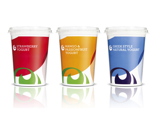
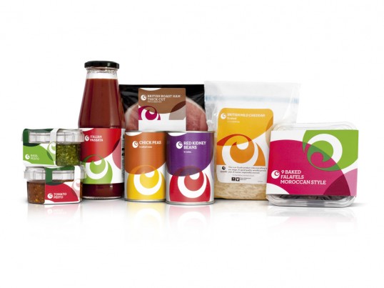
The new look & feel designed by jkr builds and elevates the existing Ocado brand mark, creating a distinctive and attractive design system which can work across the brand’s diverse range of own label products. This was then rolled out and implemented by the internal design team at Ocado.

As an online grocer, Ocado products are bought online and delivered straight to the door, so the redesign presented a unique opportunity for the creative work to exist outside the normal constraints of a supermarket environment. Free from the pressures of building navigation and appetite appeal, the design could focus on strengthening brand affinity.

The aim was to make people love Ocado’s products as much as they loved the brand. We wanted people to be happy to see the packaging in their cupboards and around their kitchens.”

Ocado

“The new design utilises the Ocado swirl to create patterns in an array colours to produce a visually engaging look for the brand. We wanted to ensure the packaging was ownable while remaining proudly Ocado. Using the brand’s existing colour palette, we created exciting combinations to complement the product and appeal to the consumer.” Matt Gilpin, Design Director, jkr.

“jkr were handed an almost impossible brief – create a beautiful, iconic, yet simple design for our own range without having control over the actual packaging material. Starting with the re-branding work that was running alongside this project, they took on the challenge with careful consideration for the brand and the constraints to which they were working under.

The end result is an iconic design system that can only be from Ocado. The combination of our new colour palette and the pattern made from the Ocado swirl is a solution that has not only taken pride of place on our own range but throughout other branding activity as well.” Tony Rivenell, Head of Brand & Customer Experience, Ocado.

From a jkr perspective, it was a real pleasure to work with such enthusiastic and passionate clients. As such, we were continuously challenged to push boundaries, driven by a real sense of collaborative energy.”

Get the latest packaging design inspiration in your inbox:

Popular designs

Mar de Anemonas – Underwater Aged Wine

Discover the unique packaging design of this underwater-aged wine, featuring a vintage label tied with a rope and a small book. Each bottle gains originality as marine life adheres to it during sea-bottom aging.

Wanderers Vodka: A Blend of Nomadic Heritage and Modern Design

The spirit of freedom and adventure is encapsulated in the design of the Wanderers Vodka. Infused with steppe herbs, the complex flavor and unique aroma transport us straight to the vast plains of the Qazaqstan steppe, where nomad tribes traversed the land for thousands of years, shaping its history.

Designed by: PepsiCo Design & Innovation
Country: United States

Ocado

lovely-package-ocado1

Ocado

Designed by jkr | Country: United Kingdom

“This month sees the launch of Ocado’s new packaging design, creating a fresh identity for the brand.

The new look & feel designed by jkr builds and elevates the existing Ocado brand mark, creating a distinctive and attractive design system which can work across the brand’s diverse range of own label products. This was then rolled out and implemented by the internal design team at Ocado.

As an online grocer, Ocado products are bought online and delivered straight to the door, so the redesign presented a unique opportunity for the creative work to exist outside the normal constraints of a supermarket environment. Free from the pressures of building navigation and appetite appeal, the design could focus on strengthening brand affinity.

The aim was to make people love Ocado’s products as much as they loved the brand. We wanted people to be happy to see the packaging in their cupboards and around their kitchens.”

Ocado

“The new design utilises the Ocado swirl to create patterns in an array colours to produce a visually engaging look for the brand. We wanted to ensure the packaging was ownable while remaining proudly Ocado. Using the brand’s existing colour palette, we created exciting combinations to complement the product and appeal to the consumer.” Matt Gilpin, Design Director, jkr.

“jkr were handed an almost impossible brief – create a beautiful, iconic, yet simple design for our own range without having control over the actual packaging material. Starting with the re-branding work that was running alongside this project, they took on the challenge with careful consideration for the brand and the constraints to which they were working under.

The end result is an iconic design system that can only be from Ocado. The combination of our new colour palette and the pattern made from the Ocado swirl is a solution that has not only taken pride of place on our own range but throughout other branding activity as well.” Tony Rivenell, Head of Brand & Customer Experience, Ocado.

From a jkr perspective, it was a real pleasure to work with such enthusiastic and passionate clients. As such, we were continuously challenged to push boundaries, driven by a real sense of collaborative energy.”
Previous slide
Next slide
Get the latest on packaging design in your inbox: