Designed by Ryan Romanes | Country: New Zealand
“Collectively 8 people were involved in the production of these boxes. Main contributors included a carpenter, digital printers, a wood routing specialist, engravers and myself. All of the contributors were supplied with concise instructions and illustrations, with a focus on their area of the process. It was important that certain stages of the construction were done prior to assemblage, for instance; the branding cut out and engraving on the bottom end of the box had to be completed before the panels were put together, otherwise the box wouldn’t fit into the engraving bed. Likewise the sanding of the boxes happened before engraving so the marks were not stripped.
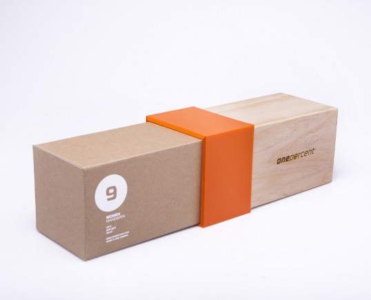
The similar tones of the corrugated card and pine complement each other while the high gloss of the acrylic band emphasizes the elegance of the brands expensive nature. The logos symbol is a stylization of the upper leg in profile, starting from knee joint and finishing at the Gluteus Maximus. The name ‘one percent’ references two topics, the first meaning; when exercising our body perspiration is made up of 99% water and 1% solute. Secondly ‘once percent’ represents exclusivity, targeting the brands high end audience. RBNo3.1 was the selected typeface. Its highly geometric form grounds the logo while movement is created when italic.”