Designed by: PepsiCo Design & Innovation
Country: United States

OneTwoTree

OneTwoTree

Designed by Mark Trzopek | Country: Australia

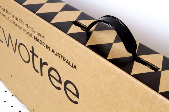
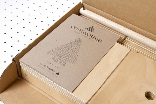
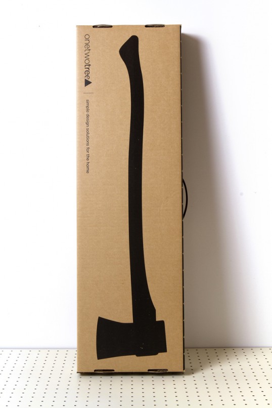
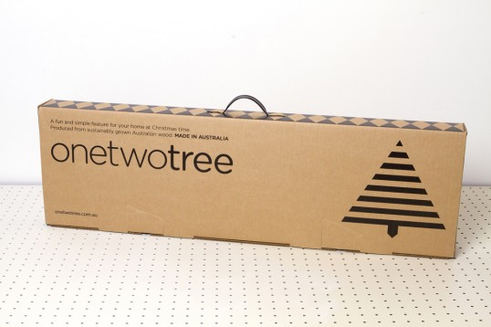
“The project included initial branding concept and logo development through to packaging and website design. The packaging was an important aspect for this start up company, as they were launching with only one product ahead of the Christmas 2012 retail period. The product is a ply-wood Christmas tree, providing an eco friendly, sustainable, and stylish alternative to regular plastic trees. The packaging needed to be strong enough to hold a 7kg wooden product, and ensure that it could be packed away each year after the Christmas period. Our considerations also included the shipping of the product around the world, so it needed to stand up to a bit of ‘rough handling’ in the postal system. The solution chosen was a cardboard carton with carry handle. We utilised a 1-colour print to keep with the companies ‘no-fuss’ ethos, as well as keeping the production under budget. The package clearly displays all important details, with a clear hierarchy of information. The graphic icon which was developed is a prominent representation of the product on the front of the package. The back of the package incorporates a playful element, another important value to the client. This being a silhouette of an axe, so when the package is carried by the handle, the customer appears to be walking away with an axe in hand. This idea played on the nostalgic practice of going out to a forest to cut down your own tree.”

OneTwoTree

OneTwoTree

OneTwoTree

OneTwoTree

Get the latest packaging design inspiration in your inbox:

Popular designs

Over the wave

This Kombucha originates in Lombok, Indonesia, where its paradise beaches attract hundreds of surfers eager to ride the waves. When you surf,

Far Out Bar

Description: Far Out Bar is a cutting-edge packaging design project created for High Life Farms’ macrodose THC chocolate bars. This project involved

Pure Persian Honey

When we look closely at honey packaging, they are almost all in the usual format, and the ultimate in creativity is that

Designed by: PepsiCo Design & Innovation
Country: United States

OneTwoTree

lovely-package-onetwotree-1

OneTwoTree

Designed by Mark Trzopek | Country: Australia

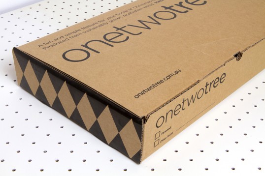
“The project included initial branding concept and logo development through to packaging and website design. The packaging was an important aspect for this start up company, as they were launching with only one product ahead of the Christmas 2012 retail period. The product is a ply-wood Christmas tree, providing an eco friendly, sustainable, and stylish alternative to regular plastic trees. The packaging needed to be strong enough to hold a 7kg wooden product, and ensure that it could be packed away each year after the Christmas period. Our considerations also included the shipping of the product around the world, so it needed to stand up to a bit of ‘rough handling’ in the postal system. The solution chosen was a cardboard carton with carry handle. We utilised a 1-colour print to keep with the companies ‘no-fuss’ ethos, as well as keeping the production under budget. The package clearly displays all important details, with a clear hierarchy of information. The graphic icon which was developed is a prominent representation of the product on the front of the package. The back of the package incorporates a playful element, another important value to the client. This being a silhouette of an axe, so when the package is carried by the handle, the customer appears to be walking away with an axe in hand. This idea played on the nostalgic practice of going out to a forest to cut down your own tree.”
OneTwoTree

OneTwoTree

OneTwoTree

OneTwoTree

Previous slide
Next slide

Explore more great package design

Get the latest on packaging design in your inbox: