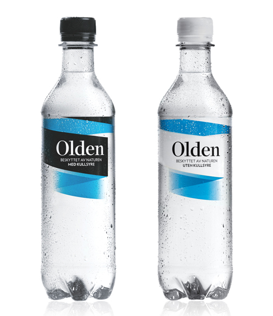
Designed by Dinamo Design & Frost Produkt | Country: Norway “Olden is a 100% clean mineral water that has been protected by nature through thousands of
Designed by Dinamo Design & Frost Produkt | Country: Norway “Olden is a 100% clean mineral water that has been protected by nature through thousands of
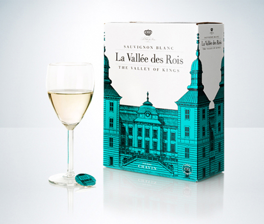
Designed by Neumeister | Country: Sweden “Input: A new BiB with white wine from La Vallée des Rois, in the Loire Valley, France. “The Kings´ Valley”
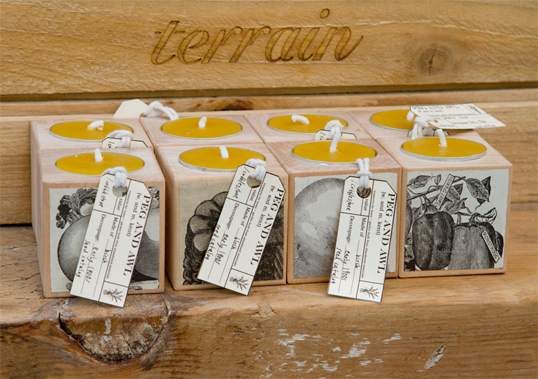
Designed by Margaux + Walter Kent | Country: United States Decorative labels cut from old engravings cover the wood holding the candle, which acts as both
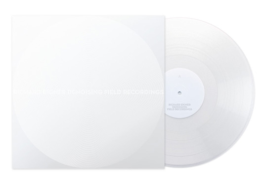
Designed by Hans Renzler | Country: Austria “The record documents the attempt at using denoising techniques on various field recordings of trains, streets, swimminghalls and public
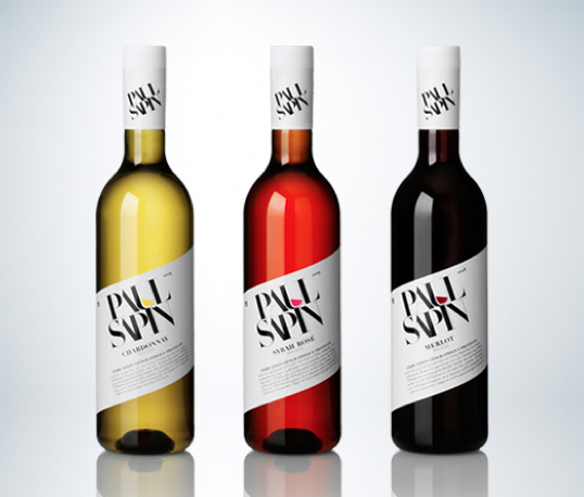
Designed by Neumeister | Country: Sweden “Input: When Paul Sapin launched their series of wine, white, red and rosé, in PET-bottles the awaited success did not
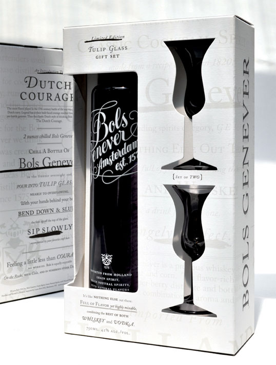
Designed by BMB NYC | Country: United States “This holiday gift pack for Bols Genever is designed as an introduction to the Dutch drinking ritual known
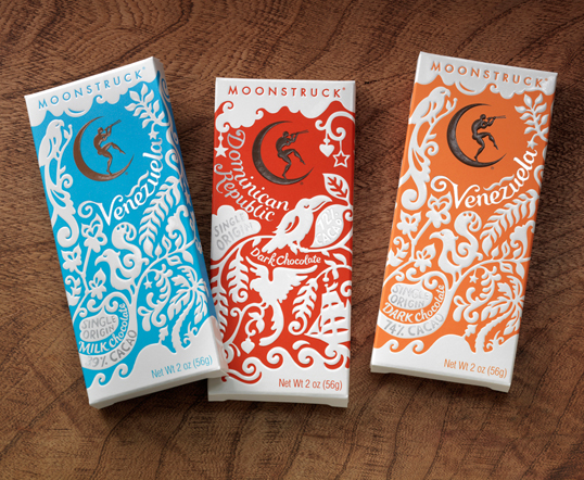
Designed by Sandstrom Partner | Country: United States “Moonstruck Single Origin Chocolate Bar Collection. Moonstruck Chocolate is a Portland, Oregon based company known for making premium
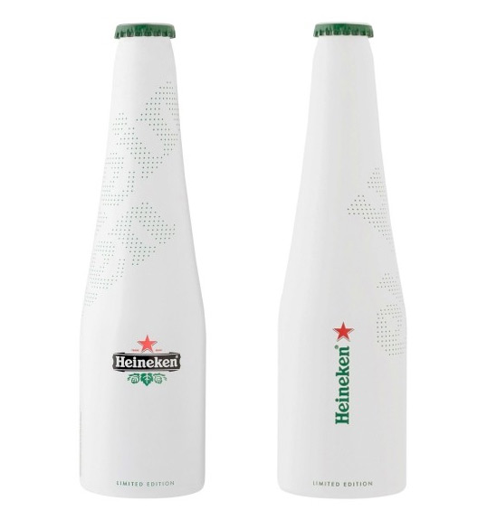
Designed by ORA-ÏTO | Country: France “Heineken and French designer ORA-ÏTO teamed up again after previous collaborations. Back in 2002 ORA-ÏTO received the ‘oscar for the
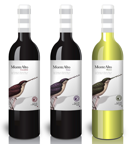
Designed by Side Effects | Country: Spain “MonteAlto is a different and lightly sparkling wine for beginners. Positioned to attract a younger market we designed a
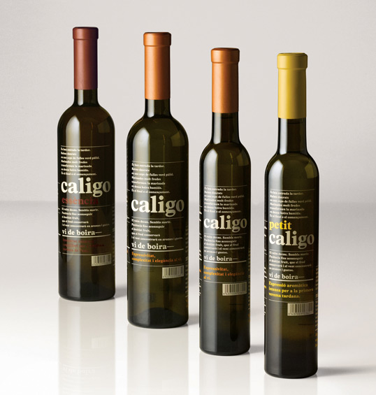
Designed by Base | Country: Spain “Late autumn in Spain’s Alt Penedes, in the hills outside of Barcelona. The annual harvest that yields the area’s dry