Designed by The Collective | Country: Australia
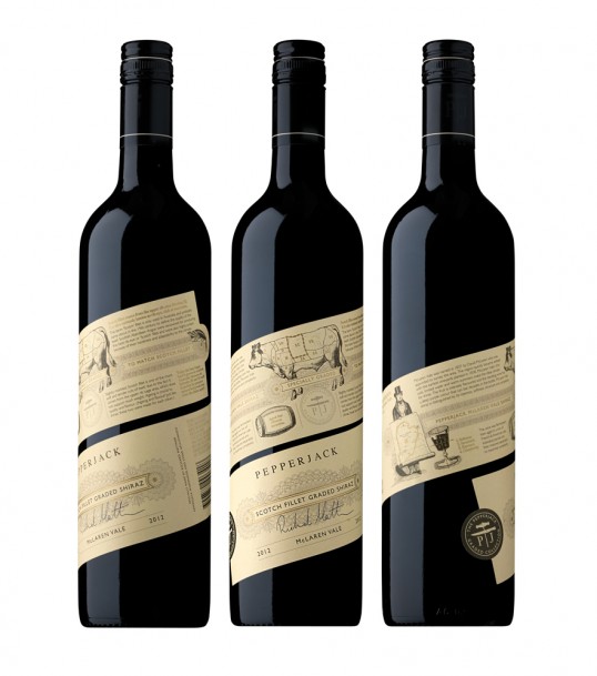
“Brief: The new Pepperjack “Graded” tier consists of two wines, each specially created to drink with specific cuts of steak, and the client wanted this message to come across strongly. Our challenge was to ensure that the new wine looked like an integral part of the Pepperjack brand, which is largely identified through its cream label applied at an angle on the bottle, but with a completely individual personality. The brief was to come up with a solution that was as distinctive as – and complemented – the core tier’s highly recognizable cream label.”

“Solution: Our solution was to utilise the angled label but keep it going all the way around and up the bottle. Each label was designed specifically for the particular cut of steak and features detailed information about each cut of steak and the wine. The distinctive Pepperjack label angle and cream brand colour unite the two tiers whilst the detailed foiling and extraordinary label form elevates Graded as a very special offering.
This label was not only challenging from a design perspective but the logistics to machine label a bottle like this were enormous. The client and their production team were so excited by the concept they bent over backwards to make it happen on their bottling line. It is by far the largest label ever applied at Treasury Wine Estates or produced by printers Collotype Labels.”