Design by Subplot Design | Country: Canada
“With 12 years of success and over 100 SKUs of premium pet food sold nationally and internationally, Petcurean Pet Nutrition looked to Subplot Design Inc. to take the brand to the next level and to elevate its identity and consumer packaging. Along with unveiling 6 brand new SKUs, Petcurean’s new corporate identity and NOW FRESH and GO! packaging launched at SuperZoo 2011 in Las Vegas last week.


Petcurean Pet Nutrition was founded in 1999 as a small start-up company, based on a unique concept that utilizes concentrated forms of meat and human grade ingredients to formulate a pet food that replicates what families enjoy at home every day. With excellent sales, a passionate mission and superior products, the brand identity itself was falling short on communicating this promise, and the product packaging was dated and had little to no differentiation between their two very different product lines.

During the thorough competitive and brand audit process, not to mention numerous interviews and extensive informal research, it became clear that they had lost their connection to their very name: Petcurean.

“Somewhere along the line, the notion of an ‘epicurean’ sensibility to pet food creation had been lost”, says Subplot Creative Director and lead designer, Matthew Clark. “Not only is an epicurean approach to health, nutrition, product innovation and superior ingredients part of the Petcurean DNA, it is also a very unique place for them in the market”.


The new brand logomark celebrates the notion of taste and nutrition through a witty use of a pet’s tongue. Other identity elements celebrate real pets from Petcurean’s employees, with typographic call-outs that reflect back to the company’s values, from “epicurean” and “health”, to “deep purrs” and “wagging tails”. Modern typography, bold imagery and strong colours unite the identity, and witty writing brings out even more of the heart and soul of the brand.

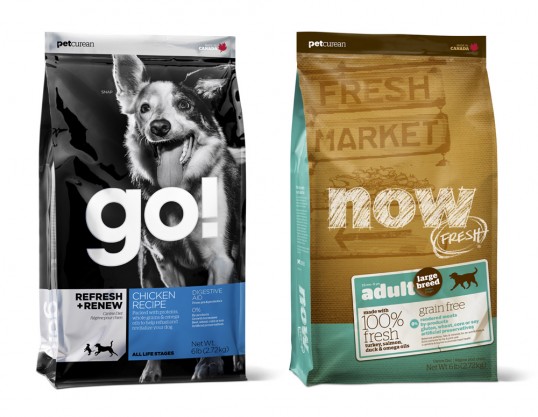
When it came to examining the almost 100 SKUs of packaging in Petcurean’s most popular lines, NOW FRESH and GO!, it was critical to expand beyond the new corporate identity to connect the unique propositions and benefits of the products themselves with the consumers who purchase them. At present, both product lines were similar in design and substrate, and offered little distinction for the consumer.

“We know that our products serve very different consumers and their pets”, says Petcurean Marketing Manager, Jaimie Turkington. “What we needed to do was to clearly identify the unique value propositions of the two lines, and then craft packaging that communicates those values clearly, concisely, and in a very engaging and appealing way for our consumers”.

GO!, Petcurean’s flagship line, is a nutrient-rich and energy-packed food. Available in various formulations, each created to have its own unique benefit including a recipe for pets with dietary sensitivities, whole-grain and grain-free recipes and recipes for various life-stages, GO! is a true fitness food for everyday pets.

“Created to put more life into your pet” trumpets this product positioning, and the packaging brings this to life with action shots of real pets who eat GO! recipes, complete with heart-warming testimonials of health and revitalization. The package itself brings an “active lifestyle” sensibility to the pet specialty store shelf with metallic foil, strong formula identification, iconography and specific call-outs for the recipes’ ingredients and benefits.


NOW FRESH is so fresh, it’s like eating off the kitchen table (down girl!). NOW FRESH is packed full of 100% fresh turkey, salmon and duck, 100% fresh Omega 3, 6 and 9 oils, and wholesome berries, fruits and vegetables.

“It could only be fresher if you made it from scratch” truly sets this product apart, and the packaging expresses this through “Fresh Market” signage, burlap textures, and familiar produce labels. Soft, warm, natural and intrinsically connected to the notion of market freshness, the package informs the reader about the superior fresh ingredients and specific life-stage recipes.

“We couldn’t be more excited about the future of our company and our brands”, adds Turkington. “Subplot’s strategic thinking and their unparalleled ability to draw insightful conclusions has been such a refreshing experience. Our product can be quite technical in nature and I have to applaud the team at Subplot for always championing our consumer’s desire for simple and clear communications”.


“And the result of that strategic insight and that refreshing simplicity, Subplot has delivered brilliant creative: an identity and packaging system that is unlike anything in the market, and is which is so true to our values and products. We honestly couldn’t be happier”.

In addition to the Brand Identity and NOW FRESH and GO! Packaging, Subplot has created all Sales Collateral, Point-of-Sale, Corporate Print Materials, Consumer Hand-outs, Tradeshow Booth and Wearables. A completely new Website, designed & developed by Harv Craven Design with Subplot’s design and creative direction, will be live in the coming weeks.

Petcurean products are currently available in the majority of pet specialty stores across Canada and a growing number across the US. Petcurean products are also sold in 25 countries worldwide.”