Designed by Chez Valois | Country: Canada
“Point G a French word, meaning the G spot… but make no mistake, don’t get any ideas, we are talking here about a gourmet spot, the rallying spot of all foodies! Because gastronomy mixes both pleasure and sensuality, it can be shared, offered, discussed… in flavours, colours, images and words. Ode to gastronomical delights in all their forms. With the new packaging platform, you lick (léchez), drink (buvez), crunch (croquez), experiment (expérimentez)… gulp (gobez), spread (tartinez), roll (tirez), pearl (perlez), sear (saisissez), share (partagez), and so on…


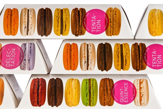
Chez Valois was mandated in 2011 to review the overall identity of the Point G brand. The challenge of the mandate was both to express and evoke the pleasure of gastronomy while depicting the enthusiasm, passion and humour of the colourful chief proprietors of Point G, Thierry and Julien. It was therefore necessary to fuse all the elements together and play with subtlety, in keeping with the manner of these two chefs. We had to be sexy without using sex. Our challenge was to create an intimacy, an interaction with the consumer, in a way that makes the initiated smile and charms even the most timid. The words appearing in fuchsia on the packaging are those associated with gastronomy and good food. Both catchy and intriguing, they surprise and titillate the imagination. The mouth-watering images depict the freshness and finesse of the product. The structural design of the boxes, in turn, provides the packaging platform with its distinctive character, enhances the sensory experience for the consumer, and allows for fun and engaging store displays.


The founders of Point G wanted to create an identity that they could relate to. Even though they are considered the masters of macarons and other gourmet delights in Montreal, they did not want to play up that reputation. In this respect, the cliché of elitist luxury that some pastry brands project was a million miles away from who Point G truly is. Because they had, some years before, come up with the irreverent idea of naming their Company Point G for Point Gourmet (or whatever else naughty minds might imagine), we wanted to assume that identity and express it fully. The result of the packaging platform is powerful, while speaking with finesse and humour. The big words are now part of the vocabulary of the brand, and express themselves without vulgarity, surfing the subtlety and sensuality of a culinary and sensory vocabulary.”