Popchips
March 12, 2010 | 7 Comments
Designed by Turner Duckworth | Country: United States | Buy it
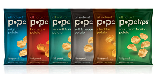
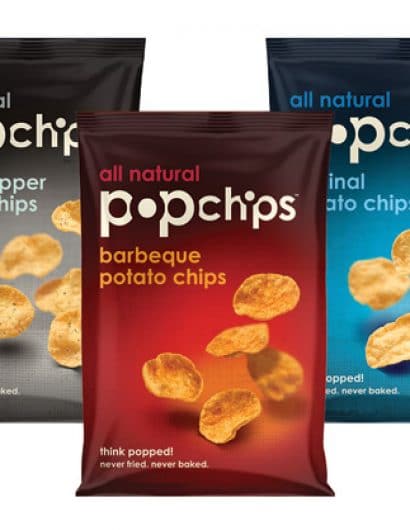
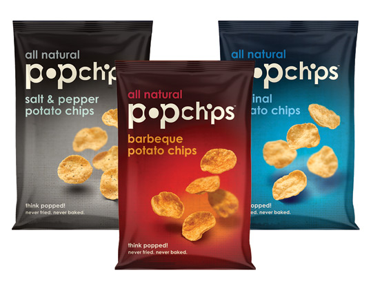
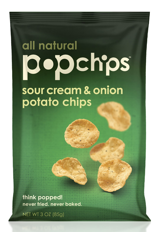
“Keith Belling, CEO of popchips, worked with Turner Duckworth, a London-based, international brand design agency with an office in San Francisco, to create the bold popchips packaging. Designed to be uncluttered and simplistic, the packaging incorporates a sans-serif typeface with the letters “o” and “i” highlighted in negative space. The packaging was originally inspired by the design of Britain’s private label packages from Marks & Spencer. Further, the popchips bags are offered in assortment of bright colors that correspond with each flavor and give the product extra pop.”
Comments
Warning: count(): Parameter must be an array or an object that implements Countable in /nfs/c02/h06/mnt/28959/domains/lovelypackage.com/html/wp-includes/class-wp-comment-query.php on line 399
7 Responses to “Popchips”
Your Comment
March 12th, 2010 @ 2:18 pm
These are so tasty… buy some, you will not regret it.
March 12th, 2010 @ 2:20 pm
I love chips! And I must say the packaging on these chips is much better then the taste!
March 12th, 2010 @ 3:07 pm
Mmm, to be honest I find the name hard to read. The photography is wonderful, and the simple background versioning works well, but there’s something about it the overall look that strikes me as “trying too hard to be cool.”
Perhaps it looks better on shelf…
March 15th, 2010 @ 6:44 am
Looks like own brand
March 15th, 2010 @ 10:57 am
I saw these while browsing in the chip section one day. I purchased some merely because of the packaging. In that cluttered environment, this was a beacon of clarity and beauty.
I don’t know about the other flavors, but BBQ tastes amazing.
March 29th, 2010 @ 7:08 am
Looks a bit inspired from the crisps of the swedish brand Garant.
http://www.garantprod.se
April 18th, 2010 @ 2:06 pm
These things taste better than any chips I’ve ever eaten–fried or “never fried.”