Designed by: PepsiCo Design & Innovation
Country: United States

Rackare

lovely-package-rackare-20

Designed by Ninja Print | Country: Sweden

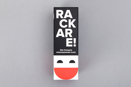
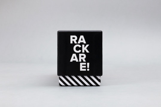
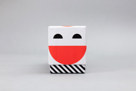
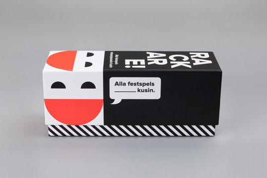
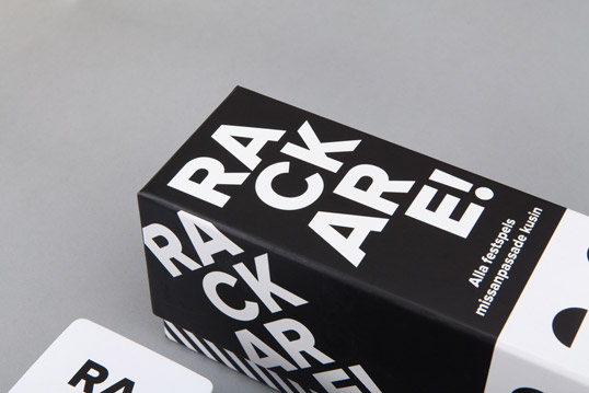
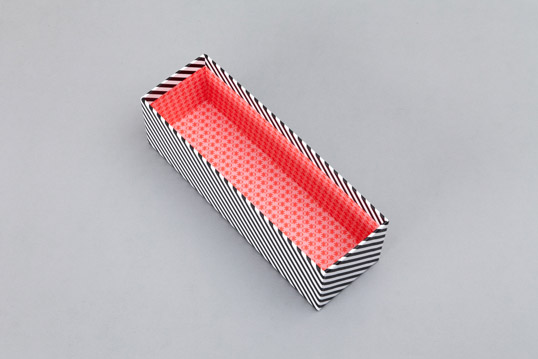
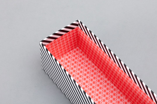
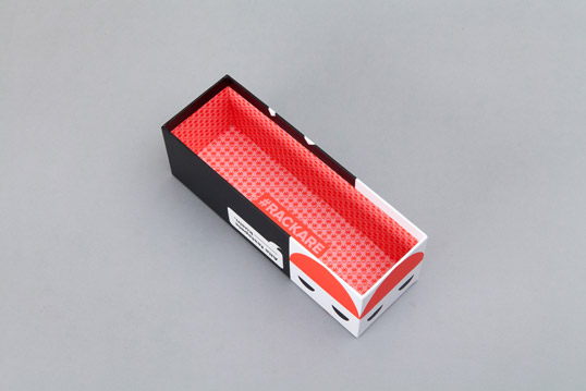
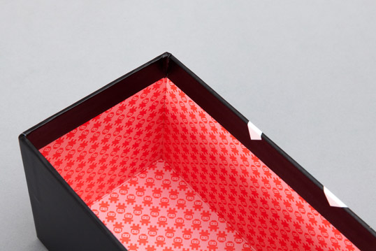
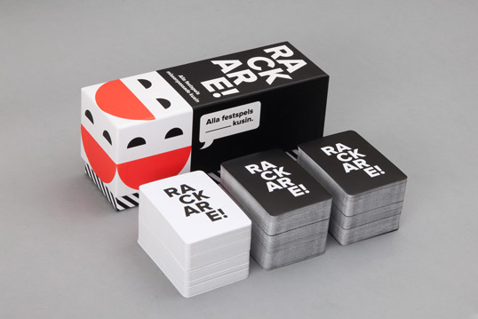
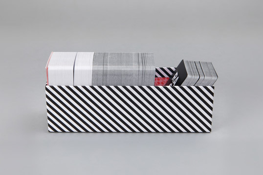
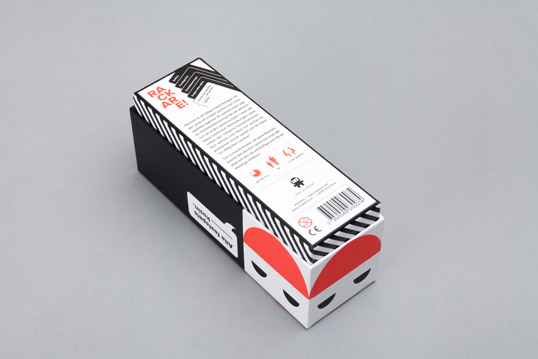
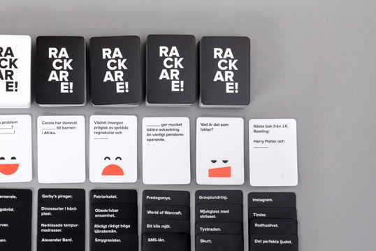
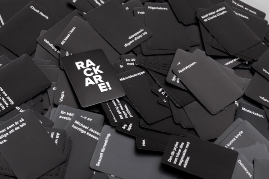
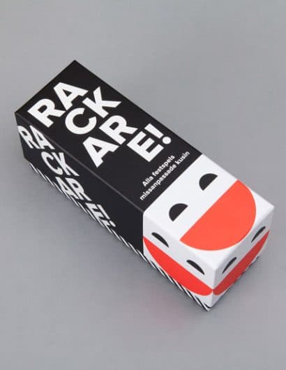
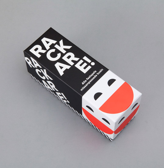
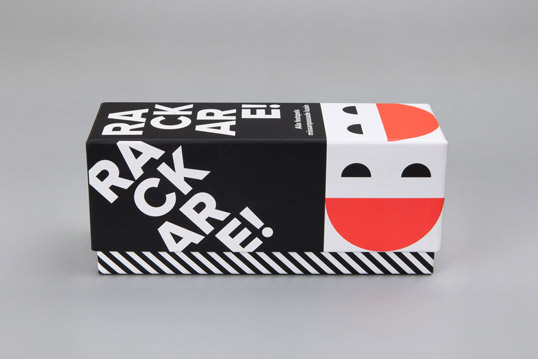
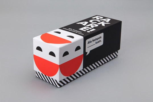
“Rackare is a Swedish adaptation of the (in)famous party game “Cards Against Humanity”. After a few alterations to the gameplay and loads of new cards written and tested the guys over at Ninja Print asked me to give it a look of its own. The very appropriate black-and-white-cards-theme got to stay, since it’s simplicity goes well with that of the game. However, I felt the game needed a cheerful vibe so the black-and-white got paired with the big smiling logo in a clean minimalist design based on three colours. A third of the cards are white, two thirds are black and hence the top lid of the box has the same proportions of black and white. Its width is also one third of its length. Both these features create a number of fun ways to display the game in stores.”
lovely-package-rackare-1 lovely-package-rackare-5 lovely-package-rackare-2 lovely-package-rackare-19 lovely-package-rackare-17 lovely-package-rackare-18 lovely-package-rackare-3 lovely-package-rackare-7 lovely-package-rackare-16 lovely-package-rackare-13 lovely-package-rackare-14 lovely-package-rackare-15 lovely-package-rackare-8 lovely-package-rackare-6 lovely-package-rackare-12 lovely-package-rackare-9 lovely-package-rackare-10

Get the latest packaging design inspiration in your inbox:

Popular designs

ZARA SKIN: More Sustainable and Refillable Packaging Design

Discover ZARA SKIN: a revolutionary skincare range reflecting ZARA’s minimalist aesthetic. With refillable, nature-inspired packaging, the line champions conscious consumption and environmental responsibility, offering an inclusive range of products for the 21st-century consumer.

Designed by: PepsiCo Design & Innovation
Country: United States

Rackare

lovely-package-rackare-20

lovely-package-rackare-20

Designed by Ninja Print | Country: Sweden

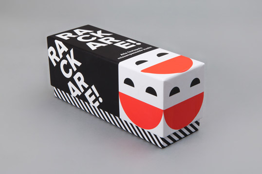
“Rackare is a Swedish adaptation of the (in)famous party game “Cards Against Humanity”. After a few alterations to the gameplay and loads of new cards written and tested the guys over at Ninja Print asked me to give it a look of its own. The very appropriate black-and-white-cards-theme got to stay, since it’s simplicity goes well with that of the game. However, I felt the game needed a cheerful vibe so the black-and-white got paired with the big smiling logo in a clean minimalist design based on three colours. A third of the cards are white, two thirds are black and hence the top lid of the box has the same proportions of black and white. Its width is also one third of its length. Both these features create a number of fun ways to display the game in stores.”
lovely-package-rackare-1 lovely-package-rackare-5 lovely-package-rackare-2 lovely-package-rackare-19 lovely-package-rackare-17 lovely-package-rackare-18 lovely-package-rackare-3 lovely-package-rackare-7 lovely-package-rackare-16 lovely-package-rackare-13 lovely-package-rackare-14 lovely-package-rackare-15 lovely-package-rackare-8 lovely-package-rackare-6 lovely-package-rackare-12 lovely-package-rackare-9 lovely-package-rackare-10

Previous slide
Next slide
Get the latest on packaging design in your inbox: