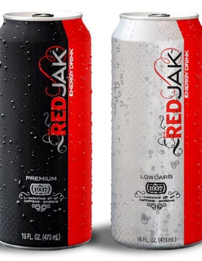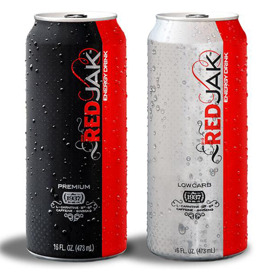
Red Jak
March 29, 2010 | 6 Comments
Designed by OFB | Country: United States
“Our brand sages found that the energy drink category had become saturated with adrenaline junkie hype and copy cat brands. Our strategists suggested that we look to stylish trends in the beer industry and take a similar approach. The result was the complete reinvention of the Red Jak brand image and a unique personality in the category. The design created a new feel of sophistication and style geared toward a more discerning energy drink consumer who has an appreciation for style.”
Comments
Warning: count(): Parameter must be an array or an object that implements Countable in /nfs/c02/h06/mnt/28959/domains/lovelypackage.com/html/wp-includes/class-wp-comment-query.php on line 399
6 Responses to “Red Jak”
Your Comment
March 29th, 2010 @ 11:10 am
Nice use of Aviano Sans!
March 29th, 2010 @ 5:23 pm
I looked at this and immediately thought of Coca-Cola due to the color scheme. I guess it might clear up confusion being in the alcohol aisle, though.
March 29th, 2010 @ 7:42 pm
These things scream Coca-Cola
March 30th, 2010 @ 11:29 am
It screams “I’m like everyone else” while at the same time, makes it harder for law enforcement to wonder if the teen is drinking booze or caffeine :/
March 30th, 2010 @ 4:26 pm
My mistake, it’s an energy drink not alcohol. Didn’t read carefully enough.
September 25th, 2011 @ 8:59 am
I guess the new design did not help much since Red Jak seems to be completely off the market.