Designed by: PepsiCo Design & Innovation
Country: United States

Scarlet Ridge

scarlet

Designed by brainCELLS | Country: Australia | Fonts used: Courier, FF Trixie, Adobe Garmond, FF Dot Matrix, Miss Robertson

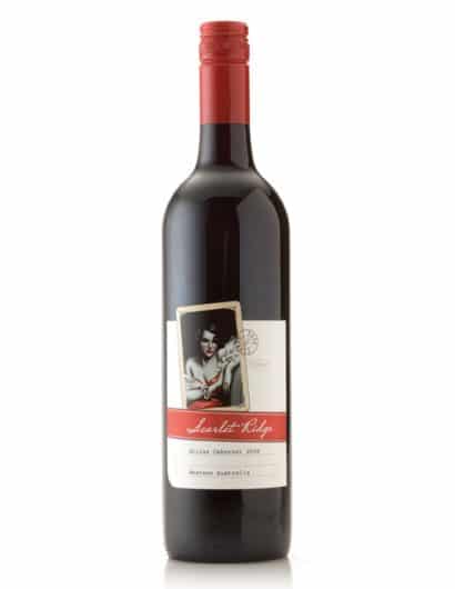
“If Scarlet Ridge wasn’t a place, but a woman, what sort of woman would she be? Would she be a pin-up girl, a journalist, a seductress, a murderer?

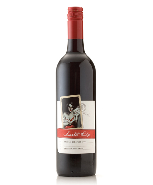
The Scarlet Ridge wine label from Western Australia’s Harvey River Bridge Wines brings the story of Scarlet Ridge to life. The concept is derived from Miss Scarlet a fictional character from the board game Cluedo and telling her story through a range of wine labels. Each label will uncover a new aspect of Miss Scarlet’s personality like buidling a detectives suspect profile. The design of the label reflects this in its use of imagery and typography.

The label is printed on Fasson Estate 8 paper stock with a rolled laid texture, high build clear varnish to the playing card and a high build red silkscreen for the words ‘Scarlet Ridge’.”

Illustrations: Malcolm Lindsay @ Scribbles Illustration Studio.

Get the latest packaging design inspiration in your inbox:

Popular designs

Innovative Mushroom-Based Packaging Used in Haircare Industry

Explore the sustainable revolution in the beauty industry, as haircare brand The Rootist partners with Morae and Evocative to create fully biodegradable and compostable packaging made from mushroom roots. An innovative solution for eco-friendly beauty essentials.

Designed by: PepsiCo Design & Innovation
Country: United States

Scarlet Ridge

scarlet

scarlet

Designed by brainCELLS | Country: Australia | Fonts used: Courier, FF Trixie, Adobe Garmond, FF Dot Matrix, Miss Robertson

“If Scarlet Ridge wasn’t a place, but a woman, what sort of woman would she be? Would she be a pin-up girl, a journalist, a seductress, a murderer?

The Scarlet Ridge wine label from Western Australia’s Harvey River Bridge Wines brings the story of Scarlet Ridge to life. The concept is derived from Miss Scarlet a fictional character from the board game Cluedo and telling her story through a range of wine labels. Each label will uncover a new aspect of Miss Scarlet’s personality like buidling a detectives suspect profile. The design of the label reflects this in its use of imagery and typography.

The label is printed on Fasson Estate 8 paper stock with a rolled laid texture, high build clear varnish to the playing card and a high build red silkscreen for the words ‘Scarlet Ridge’.”

Illustrations: Malcolm Lindsay @ Scribbles Illustration Studio.

Previous slide
Next slide
Get the latest on packaging design in your inbox: