Schroeder Milk
November 4, 2009 | 4 Comments
Designed by Capsule | Country: United States
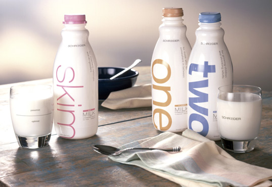
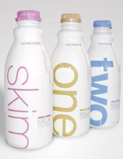
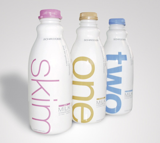
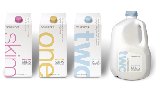
“We designed a completely new look for Schroeder, one that communicated on three levels. The first level is a clean, white opaque package that communicated a European sophistication. The next level is the use of the words One, Two, Whole, and Skim each scaled reflect the fat level of the milk, The last is the use of rotating, esoteric phrases that spoke to consumers in an anti-marketing language. Phrases like for dreamers and optimists and for those who fall somewhere in between. The early results speak for themselves. Schroeder saw a sustained 15% increase in distribution due to their new packaging and 22% increase in sales of milk during a recessionary economy.”
Comments
Warning: count(): Parameter must be an array or an object that implements Countable in /nfs/c02/h06/mnt/28959/domains/lovelypackage.com/html/wp-includes/class-wp-comment-query.php on line 399
4 Responses to “Schroeder Milk”
Your Comment
November 4th, 2009 @ 9:21 am
It looks like they did a simple refresh of Bamboo’s design from 2002 in which they were already using the carying typoe weights and opaque plastic bottles. Bamboo made this design famous and should get credit for being the originator. All Capsule did was mute the colors, adjust the copy placement and messaging. They should get credit for not ruining a good thing, but not credit for this design approach.
November 4th, 2009 @ 9:27 am
delicious
November 5th, 2009 @ 9:34 pm
smooth ….
November 17th, 2009 @ 5:36 pm
What font was used for this design?