Designed by: PepsiCo Design & Innovation
Country: United States

Scottex

Scottex

Designed by ARC’S | Country: Italy | Font: ITC Avant Garde Gothic

“Kimberly Clark operates in some European markets thanks to the Scottex brand, Italy among them. Scottex is mostly associated to toilet paper and stands for softness and quality guarantee.

However, in Italy, Scottex also produces a range of pocket tissues that over the years has shown some weaknesses, such as poor brand identity and visibility.
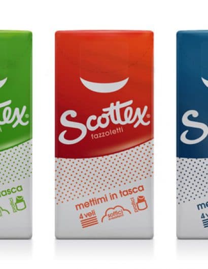
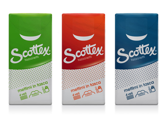
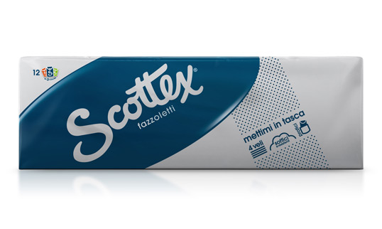
ARC’S interpreted its restyling with the objective to reinforce the identity of Scottex pocket tissues, by defining a visual system exalting the Scottex brand and connecting the product to the brand.

The result is a strong visual identity that gives back impact to the Scottex brand and expressive strength to pocket tissues as well, improving shelf visibility too.

Colours are an extremely important identity element. The use of paste silver as serigraphy base (since unknown to the line) gives new intensity and innovation to the packet. Silver is the colour common to each individual packet and packets come in impacting shades and have strong characterization.”

Scottex

Get the latest packaging design inspiration in your inbox:

Popular designs

Motivational Sock Packaging: A Good Start to Your Day

Discover ‘Good Start’, a new sock brand designed to motivate. Each pack contains seven pairs of socks, each adorned with motivational quotes from famous personalities, intended to inspire a positive start to the day.

Introducing Nasbah: Egyptian Product Packaging Design

Uncover how the Egyptian product “Nasbah” is taking a contemporary approach to package design, making a mark in the local market. Learn how the design strategy influences consumer perception and enhances product appeal.

Designed by: PepsiCo Design & Innovation
Country: United States

Scottex

scottex1

Scottex

Designed by ARC’S | Country: Italy | Font: ITC Avant Garde Gothic

“Kimberly Clark operates in some European markets thanks to the Scottex brand, Italy among them. Scottex is mostly associated to toilet paper and stands for softness and quality guarantee.

However, in Italy, Scottex also produces a range of pocket tissues that over the years has shown some weaknesses, such as poor brand identity and visibility.
ARC’S interpreted its restyling with the objective to reinforce the identity of Scottex pocket tissues, by defining a visual system exalting the Scottex brand and connecting the product to the brand.

The result is a strong visual identity that gives back impact to the Scottex brand and expressive strength to pocket tissues as well, improving shelf visibility too.

Colours are an extremely important identity element. The use of paste silver as serigraphy base (since unknown to the line) gives new intensity and innovation to the packet. Silver is the colour common to each individual packet and packets come in impacting shades and have strong characterization.”
Scottex

Previous slide
Next slide
Get the latest on packaging design in your inbox: