Designed by: PepsiCo Design & Innovation
Country: United States

Seagram’s

Seagram's
Designed by Hatch | Country: United States

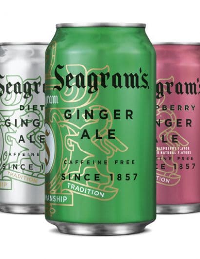
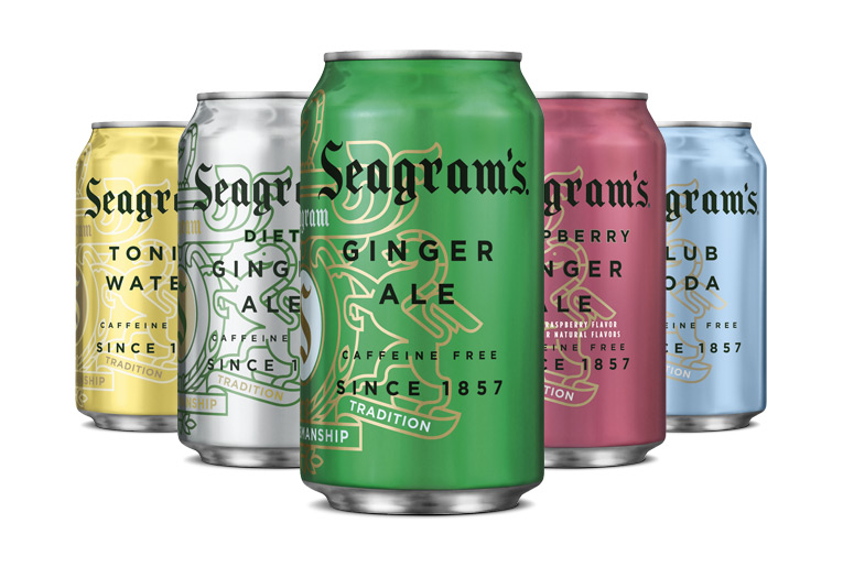
“Seagram’s is an iconic, well-respected brand. The Coca-Cola Company asked Hatch to help refresh the Seagram’s sparkling line and make it more relevant to the sophisticated adult consumer who is tired of overly sweet beverages. We modernized the brand’s crest and then used it in ways that announce that something new is going on. The crest is now more of a friendly element than a crown jewel, with visual treatments such as placing type over it and wrapping it around the corners of cases. And in order to help consumers shop amongst flavors, the cans are flooded with crisp, clean metallic versions of the colors consumers associate with the flavors category-wide.”
Seagram's

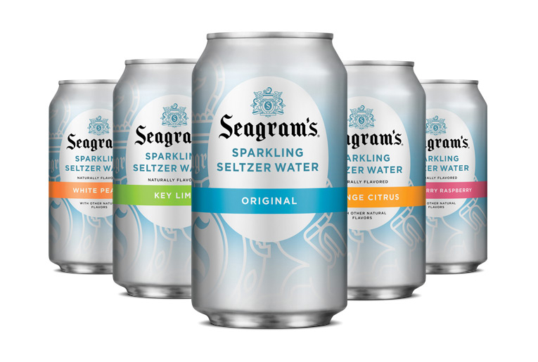
“So successful was this complete brand refresh, we applied the same design principles to the Seagram’s line of Sparkling Seltzers as well.”

Seagram's

Get the latest packaging design inspiration in your inbox:

Popular designs

Inverey: A Unique Barrel-Aged Scottish Gin Packaging Design

Inverey stands out with its image that captures the essence of the rugged Highland countryside. Breaking away from the norm, the label design does not feature the traditional tartan. Instead, it presents an organised structure of intertwining circles, rhombuses, four-pointed stars and dots born out of their intersection.

Motivational Sock Packaging: A Good Start to Your Day

Discover ‘Good Start’, a new sock brand designed to motivate. Each pack contains seven pairs of socks, each adorned with motivational quotes from famous personalities, intended to inspire a positive start to the day.

Designed by: PepsiCo Design & Innovation
Country: United States

Seagram’s

Seagram's

Seagram's
Designed by Hatch | Country: United States

“Seagram’s is an iconic, well-respected brand. The Coca-Cola Company asked Hatch to help refresh the Seagram’s sparkling line and make it more relevant to the sophisticated adult consumer who is tired of overly sweet beverages. We modernized the brand’s crest and then used it in ways that announce that something new is going on. The crest is now more of a friendly element than a crown jewel, with visual treatments such as placing type over it and wrapping it around the corners of cases. And in order to help consumers shop amongst flavors, the cans are flooded with crisp, clean metallic versions of the colors consumers associate with the flavors category-wide.”


Seagram's

“So successful was this complete brand refresh, we applied the same design principles to the Seagram’s line of Sparkling Seltzers as well.”

Previous slide
Next slide
Get the latest on packaging design in your inbox: