Designed by: PepsiCo Design & Innovation
Country: United States

Selfridges & Co

se1

Designed by Dave Richmond | Country: United Kingdom | Font: Trade Gothic

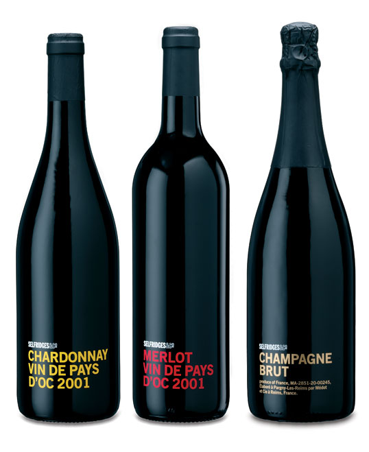
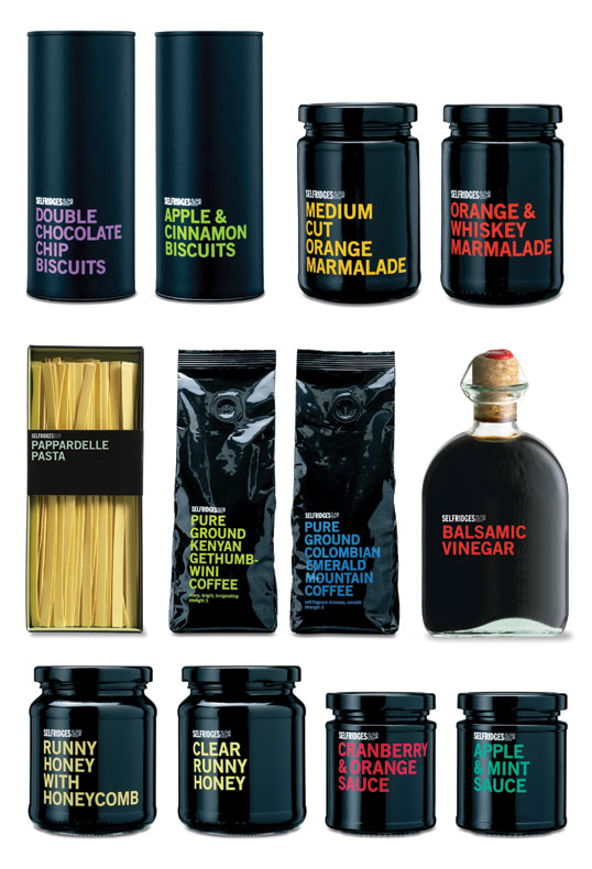
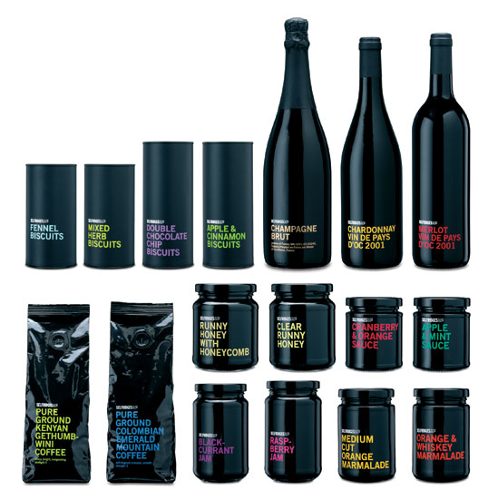
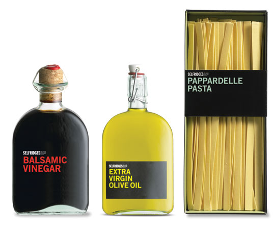
“A re-branded food range that echo the store’s forward thinking and contemporary attitude towards retail. Although there were over 100 own brand products within the store it was somewhat unrecognisable and lacked shelf presence. Our approach was to create a range that was unique; that did not follow any traditional sector cues. Colour coding everything black would make an incredible statement with only the type to reflect what was inside for example strawberry jam would have pink type. The typeface use

d was trade gothic range left and all the same point size across the range where possible. This ensured clarity and uniformity.”
se5

se4

se3

se2

zp8497586rq

Popular designs

Wanderers Vodka: A Blend of Nomadic Heritage and Modern Design

The spirit of freedom and adventure is encapsulated in the design of the Wanderers Vodka. Infused with steppe herbs, the complex flavor and unique aroma transport us straight to the vast plains of the Qazaqstan steppe, where nomad tribes traversed the land for thousands of years, shaping its history.

Inverey: A Unique Barrel-Aged Scottish Gin Packaging Design

Inverey stands out with its image that captures the essence of the rugged Highland countryside. Breaking away from the norm, the label design does not feature the traditional tartan. Instead, it presents an organised structure of intertwining circles, rhombuses, four-pointed stars and dots born out of their intersection.

Designed by: PepsiCo Design & Innovation
Country: United States

Selfridges & Co

se1

se1

Designed by Dave Richmond | Country: United Kingdom | Font: Trade Gothic

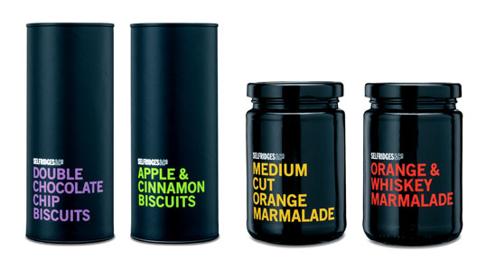
“A re-branded food range that echo the store’s forward thinking and contemporary attitude towards retail. Although there were over 100 own brand products within the store it was somewhat unrecognisable and lacked shelf presence. Our approach was to create a range that was unique; that did not follow any traditional sector cues. Colour coding everything black would make an incredible statement with only the type to reflect what was inside for example strawberry jam would have pink type. The typeface use

d was trade gothic range left and all the same point size across the range where possible. This ensured clarity and uniformity.”
se5

se4

se3

se2

zp8497586rq
Previous slide
Next slide