Designed by Glendall Design | Country: United Kingdom
“You are likely to be familiar with the bright yellow fields that populate the countryside but are unaware that Rapeseed can produce a culinary oil that boasts half the saturated fat of olive oil, high levels of Omega 3 and 6, and is produced using nothing artificial. Our client’s trials revealed their crop produced a delicious mild, nutty taste and a natural golden colour to the oil that was too good not to sell.”

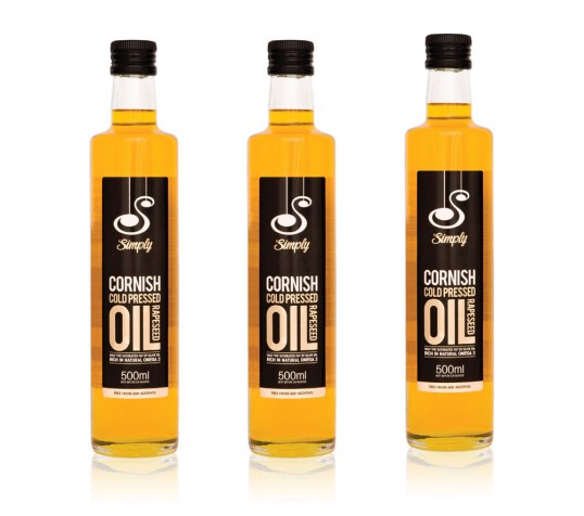
“Our challenge was to name, brand and produce shelf-ready packaging and marketing to launch at a national show. Working closely with the client we established a strong set of values that would help shape the brand and produce a contemporary Cornish product with a powerful shelf presence. ‘Simply’ reflects the oils honest production methods and allows scope for future product ranges, punchy typography and a bold colour scheme transferred straight over to the marketing material to create a vibrant backdrop at the show.
It’s early days for the brand but Simply’s success is growing, with Jamie Oliver’s Fifteen using the product as it’s primary culinary oil. Rick Stein’s delicatessen were one of numerous specialist food retailers to place large orders and with expansion throughout the SouthWest there are now further plans for a larger distribution network.”