Skandia
September 8, 2009 | 2 Comments
Designed by BBDK | Country: United States
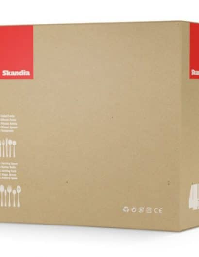
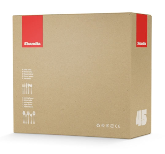
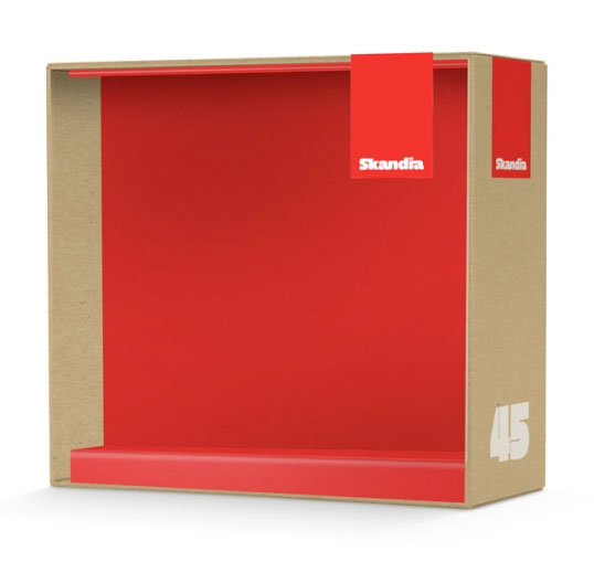
Lovers of minimalism will enjoy this packaging solution for a Scandanavian flatware company.
“A selection of proposed packaging solutions for Skandia, a flatware company with a Scandinavian design aesthetic that is carried in stores such as Target, Bed Bath & Beyond and Crate&Barrel. Skandia wanted a look and feel that expressed their love of clean and simple design. BBDK responded with designs ranging from eco-friendly solutions using single color soy-based inks and recycled kraft paper to variations using traditional litho label. All of the designs had the flexibility to expand into complete packaging systems that could be translated across international markets.”
Comments
Warning: count(): Parameter must be an array or an object that implements Countable in /nfs/c02/h06/mnt/28959/domains/lovelypackage.com/html/wp-includes/class-wp-comment-query.php on line 399
2 Responses to “Skandia”
Your Comment
September 8th, 2009 @ 6:24 am
At a quick glance it looks like they nicked the logo of a Swedish insurance company. Sure looks similar. Did they just Google “Scandia”?!
http://www.skandia.se.
The package has more of a Swiss feel than Scandinavian due to the typography and color scheme. But there’s nothing wrong with Swiss typography and scandinavian typography is based on the swiss anyhow.
September 9th, 2009 @ 7:51 am
Simple and minimalistic. Loved it.
Feels great.