Designed by: PepsiCo Design & Innovation
Country: United States

Solcare

Solcare

Designed by Lavernia & Cienfuegos | Country: Spain

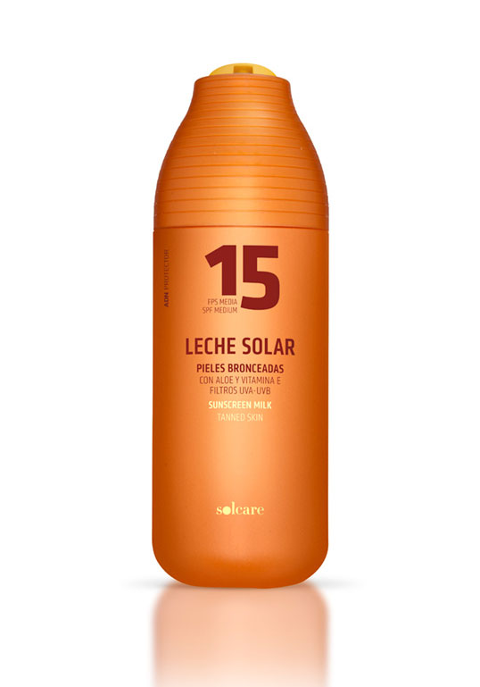
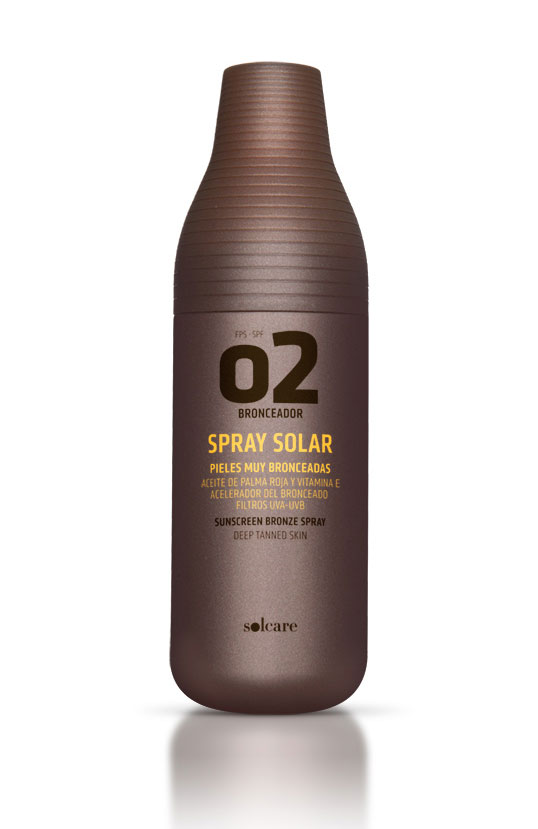
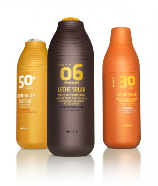
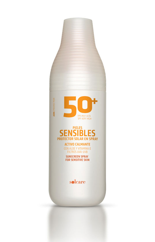
“Packaging and graphic design of sun-care range, sold in Mercadona supermarkets. The project had a very demanding brief to optimize processes and costs, without sacrificing that the product communicates quality, is attractive and has a strong presence on the shelf. For the 36 references we designed two bottles. These two packs support different lids and different dosing mechanisms: pumps, sprays, disc-top… and also the design gives an effective response to the two objectives of the project: on one hand, solve problems of logistics and production; on the other, with only two packages, obtain a highly differentiated range of products, with its own personality. The colors of the containers provide the necessary differentiation between the sub-ranges of products: sunscreen, tanning, aftersun… The graphics serve as a rapid and clear identification of each one of them. This is achieved by the prominent and powerful presence of a numeral that indicates the protection factor, a key element in the purchase decision, and that at the same time strengthens the personality of the range.”

Solcare

Solcare

Solcare

Get the latest packaging design inspiration in your inbox:

Popular designs

Burma Love Rebrand

Love at First BiteAs an extension of the Burma Superstar restaurant in San Francisco, Burma Love Foods gives diners an opportunity to

The Bra Guru

Most women are wearing the wrong size bra and that is a fact. The Bra Guru® is the first and only professional

Designed by: PepsiCo Design & Innovation
Country: United States

Solcare

lovely-package-solcare1

Solcare

Designed by Lavernia & Cienfuegos | Country: Spain

“Packaging and graphic design of sun-care range, sold in Mercadona supermarkets. The project had a very demanding brief to optimize processes and costs, without sacrificing that the product communicates quality, is attractive and has a strong presence on the shelf. For the 36 references we designed two bottles. These two packs support different lids and different dosing mechanisms: pumps, sprays, disc-top… and also the design gives an effective response to the two objectives of the project: on one hand, solve problems of logistics and production; on the other, with only two packages, obtain a highly differentiated range of products, with its own personality. The colors of the containers provide the necessary differentiation between the sub-ranges of products: sunscreen, tanning, aftersun… The graphics serve as a rapid and clear identification of each one of them. This is achieved by the prominent and powerful presence of a numeral that indicates the protection factor, a key element in the purchase decision, and that at the same time strengthens the personality of the range.”
Solcare

Solcare

Solcare

Previous slide
Next slide

Explore more great package design

Get the latest on packaging design in your inbox: