Designed by: PepsiCo Design & Innovation
Country: United States

Southern Gothic Wine

southern1

Designed by James Jean | Country: United States

“I worked with the Grateful Palate a while ago on a series of wine labels, and they are finally available for sale. The theme was Southern Gothic, and I brainstormed some concepts with owner Dan Philips and designer Beth Elliot. They gave me a lot of creative freedom, and the typography was expertly done by Jeff Keedy. There are little bits of foil printed in the intricate framing elements.

I researched the imagery and stories from the region and time period to get inspired: some immediate triggers were kudzu, sprawling oak trees, and antebellum images like the Southern Belle.”
southern2

southern3

southern4

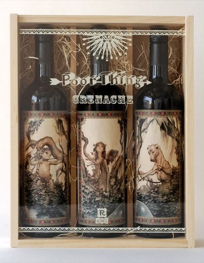
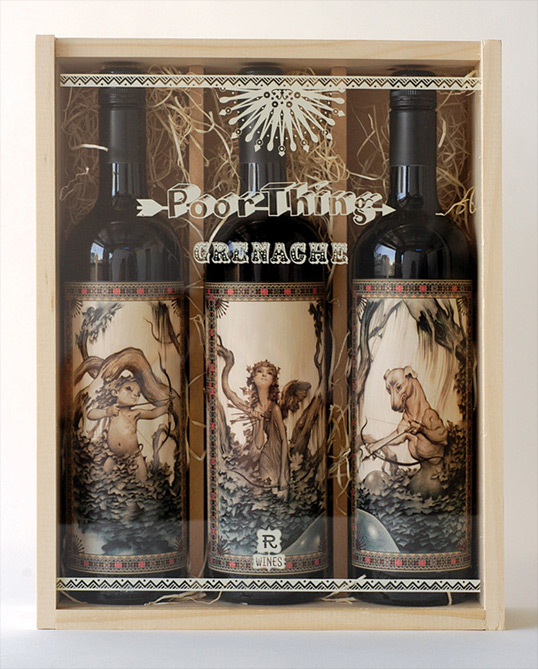
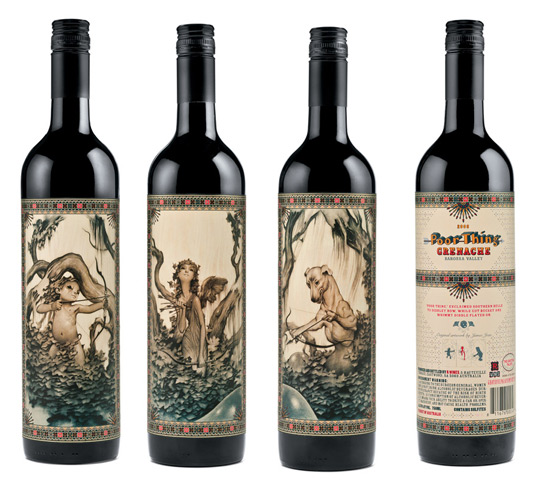
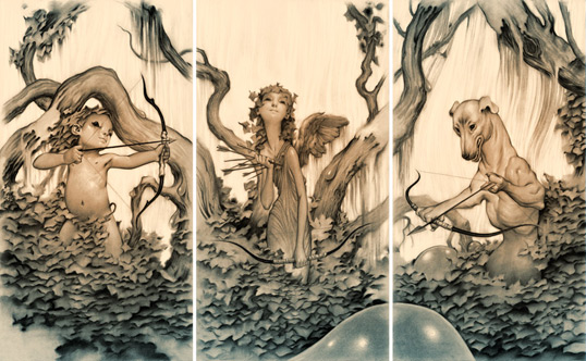
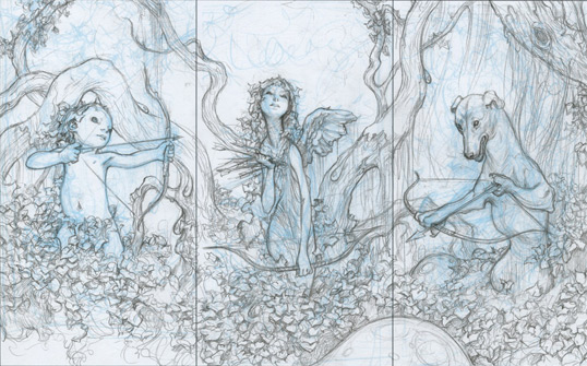
“‘Poor Thing’ depicts a forest populated by a trio of characters representing thwarted desires, draped with kudzu. A bloated cupid draws back his bow, perhaps in an effort to protect the angel from a hound that has become a hunter. Meanwhile, the oak trees are weeping while witnessing this sad romance, redolent of the heat and humidity of the South.”

southern5

southern6

southern7

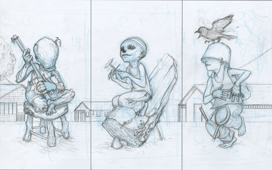
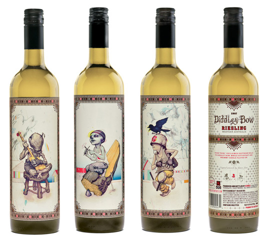
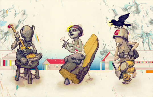
“The ‘gut bucket’ blues became the inspiration for the ‘Didley Bow’ series. I always liked the idea that music could be cobbled together from the simplest of materials, so the characters are all connected to something elemental, if not being elemental themselves. Being somewhat of an amateur musician, I used colors that were evocative of the music, acidic yellows and reds, in addition to bruised purples in the line work.”

southern8

southern9

southern10

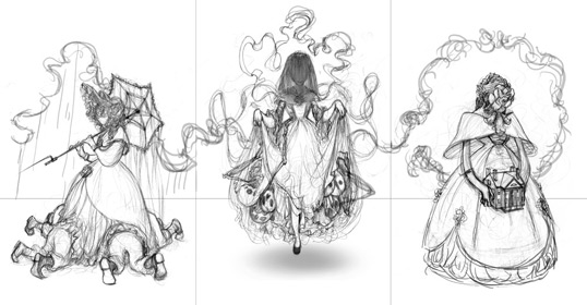
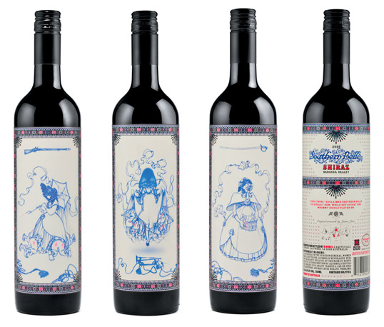
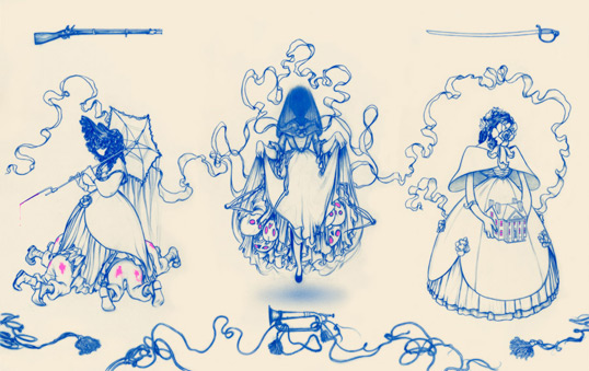
“‘Southern Belle’ was created to resemble fine china. One tradition of Southern Gothic literature is to subvert traditional stereotypes of the antebellum period. The element of hypocrisy plays a huge role in these characters. I also have an interest in exploring gender issues, though subtly, in much of my work. The first bottle is the ‘promiscuous belle’ wielding her deadly charms on her suitors, the second bottle is the ‘mourning belle’ with all the skeletons of the past emerging from under her dress, and the last bottle is the “homemaker”, who tries to contain and control appearances on the estate as if it were a doll house.”

Get the latest packaging design inspiration in your inbox:

Popular designs

Designed by: PepsiCo Design & Innovation
Country: United States

Southern Gothic Wine

southern1

southern1

Designed by James Jean | Country: United States

“I worked with the Grateful Palate a while ago on a series of wine labels, and they are finally available for sale. The theme was Southern Gothic, and I brainstormed some concepts with owner Dan Philips and designer Beth Elliot. They gave me a lot of creative freedom, and the typography was expertly done by Jeff Keedy. There are little bits of foil printed in the intricate framing elements.

I researched the imagery and stories from the region and time period to get inspired: some immediate triggers were kudzu, sprawling oak trees, and antebellum images like the Southern Belle.”
southern2

southern3

southern4

“‘Poor Thing’ depicts a forest populated by a trio of characters representing thwarted desires, draped with kudzu. A bloated cupid draws back his bow, perhaps in an effort to protect the angel from a hound that has become a hunter. Meanwhile, the oak trees are weeping while witnessing this sad romance, redolent of the heat and humidity of the South.”
southern5

southern6

southern7

“The ‘gut bucket’ blues became the inspiration for the ‘Didley Bow’ series. I always liked the idea that music could be cobbled together from the simplest of materials, so the characters are all connected to something elemental, if not being elemental themselves. Being somewhat of an amateur musician, I used colors that were evocative of the music, acidic yellows and reds, in addition to bruised purples in the line work.”
southern8

southern9

southern10

“‘Southern Belle’ was created to resemble fine china. One tradition of Southern Gothic literature is to subvert traditional stereotypes of the antebellum period. The element of hypocrisy plays a huge role in these characters. I also have an interest in exploring gender issues, though subtly, in much of my work. The first bottle is the ‘promiscuous belle’ wielding her deadly charms on her suitors, the second bottle is the ‘mourning belle’ with all the skeletons of the past emerging from under her dress, and the last bottle is the “homemaker”, who tries to contain and control appearances on the estate as if it were a doll house.”

Explore more great package design

Get the latest on packaging design in your inbox: