Designed by: PepsiCo Design & Innovation
Country: United States

Starbucks

Starbucks

Designed by Starbucks & Lippincott | Country: United States

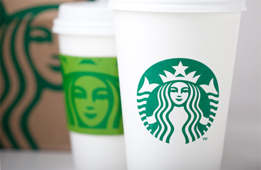
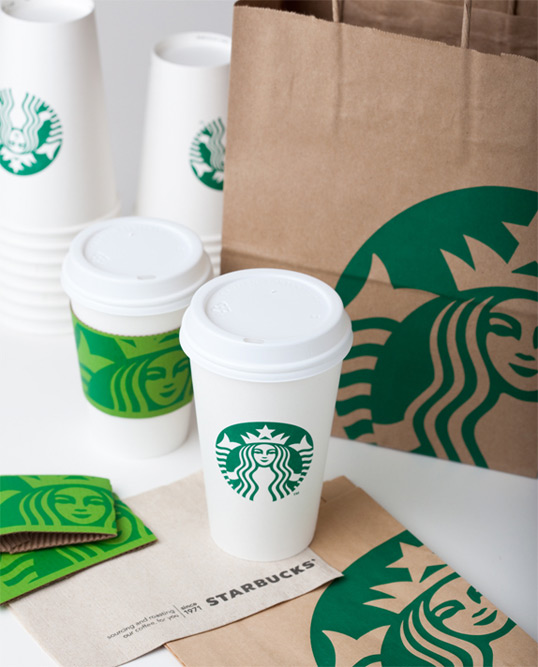
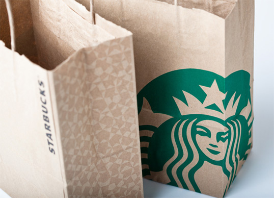
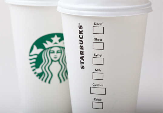
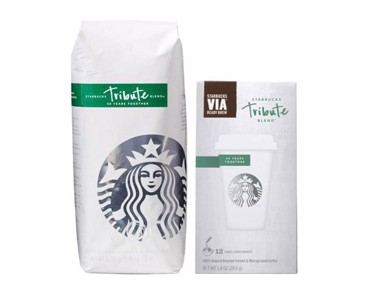
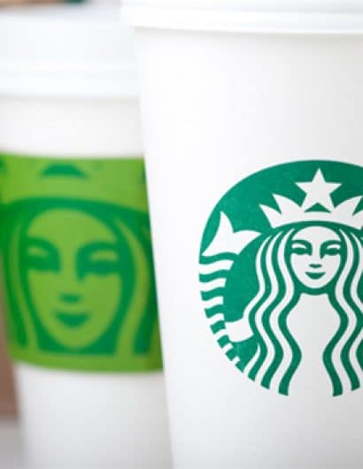
“From the start, we wanted to recognize and honor the important equities of the iconic Starbucks logo. So we broke down the four main parts of the mark — color, shape, typeface and the Siren. After hundreds of explorations, we found the answer in simplicity. Removing the words from the mark, bringing in the green, and taking the Siren out of her ring. For forty years she’s represented coffee, and now she is the star.

The details came next. The 20-year old logo was built in the early days of AutoTrace and it showed — points everywhere. We improved composition, brought in more sophisticated stroke width and spacing and a smoother line flow. When it came to her — the Siren — we enhanced her form in subtle ways, smoothing her hair, refining her facial features, weighting the scales on her tail to bring the focus to her face. We enlisted the branding firm of Lippincott to help with these refinements, and give us a better global perspective on the entire identity system.”

Starbucks

Starbucks

Starbucks

Starbucks

Via Brand New

Get the latest packaging design inspiration in your inbox:

Popular designs

Over the wave

This Kombucha originates in Lombok, Indonesia, where its paradise beaches attract hundreds of surfers eager to ride the waves. When you surf,

Burma Love Rebrand

Love at First BiteAs an extension of the Burma Superstar restaurant in San Francisco, Burma Love Foods gives diners an opportunity to

The Bra Guru

Most women are wearing the wrong size bra and that is a fact. The Bra Guru® is the first and only professional

Designed by: PepsiCo Design & Innovation
Country: United States

Starbucks

starbucks1

Starbucks

Designed by Starbucks & Lippincott | Country: United States

“From the start, we wanted to recognize and honor the important equities of the iconic Starbucks logo. So we broke down the four main parts of the mark — color, shape, typeface and the Siren. After hundreds of explorations, we found the answer in simplicity. Removing the words from the mark, bringing in the green, and taking the Siren out of her ring. For forty years she’s represented coffee, and now she is the star.

The details came next. The 20-year old logo was built in the early days of AutoTrace and it showed — points everywhere. We improved composition, brought in more sophisticated stroke width and spacing and a smoother line flow. When it came to her — the Siren — we enhanced her form in subtle ways, smoothing her hair, refining her facial features, weighting the scales on her tail to bring the focus to her face. We enlisted the branding firm of Lippincott to help with these refinements, and give us a better global perspective on the entire identity system.”

Starbucks

Starbucks

Starbucks

Starbucks

Via Brand New

Explore more great package design

Get the latest on packaging design in your inbox: