Designed by Also Known As | Country: Canada
“Project overview: Steel and Oak Brewing Co symbolizes the modernness of today while paying homage to the craftsmanship of years long past. A bright young voice in New Westminster’s storied past, Steel and Oak is bringing a refreshed perspective and vibrant energy to the craft beer scene.
Supportive, open minded and encouraging clients like this remind us why we opened our doors in the first place. Champions of the process, Steel & Oak embraced the opportunity to get involved and realize their visions through our creative lens. The perspective and insights we gained through working closely and personably with the client helped us create design solutions that resonated early and easily.”


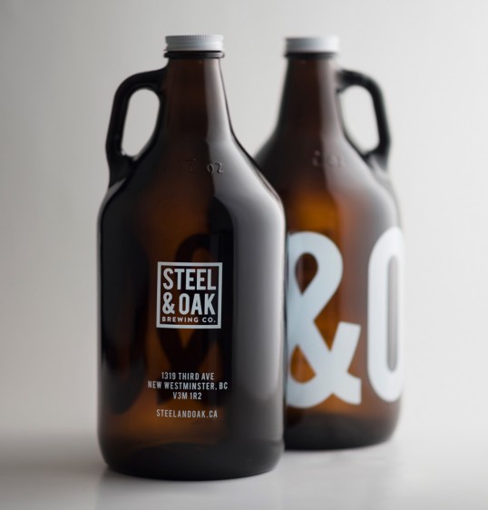
“Design and creative solution: Our design approach was to create a bold, modern look for Steel & Oak’s lineup of bottles and growlers, by designing a cohesive system that stretches across a variety of products creates unshakable consistency and pays dividends towards creating a recognizable brand. The iconic S&O monogram arrangement was created to act as a associative trigger and secondary logo; an easier and more digestible way to infer the full brand.
Current trends and the existing visual landscape heavily influenced our design direction, but we also wanted to consider how and where the products would live, from the tasting room display all the way through to the customers fridge. We feel as though the design netted out in a place that reflected the ethos of the Steel & Oak brand, every step of the way.”