Designed by: LP/ws Design Studios | Country: US
Stone Creek Coffee reached out to LP/ws, an award-winning creative platform, to help the company reposition its brand and create a new line of packaging designs that would reflect its values and mission.
Stone Creek Coffee was founded by Eric Resch in 1993, with the idea of caring for people around him.
The official website of the company mentions the following:
“…Stone Creek Coffee was built on the idea that we have an obligation to care for those around us. We have endeavored to conduct our business with this authentic care as we’ve grown from a single, small cafe in Whitefish Bay to where we are today. We call downtown Milwaukee ‘home,’ and we work to see the flourishing of this great city.”


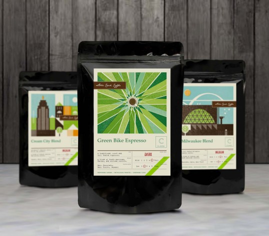
The packaging
Lp/ws worked on creating the packaging design for three new flavors: Classic, Seasonal, and Lab. One of the hallmarks of the packaging design is the geometrical shapes that look like everyday objects. From simple color schemes to fonts: the packaging design appears relevant and uncomplicated.
“For the past 5 months, LP/w has helped Stone Creek Coffee redefine and reposition their brand. We started with the first manual brew bar in Milwaukee, Wisconsin and now we are releasing all-new packaging. We’d like to introduce our three new series of coffee: Classic, Seasonal and Lab. The Classic series includes all-time favorites like French Roast and Cream City Blend. The Seasonal series is only special selections that will change over the course of the year. The Lab series is for the uber coffee geek, and will be very limited in availability and quantity (often single-sourced from a very small farm that only produces about 20 bags of coffee in total).
We are reorganizing our coffee line better reflects the complex palette of our customers. Often, our loyal customers simply want to wake up and drink a dark roast coffee like our French Roast, and we equate this to comfort food to start off the day. Different customers (or sometimes the same) want to be more experimental and see what is on the cutting edge of coffee. Foodies often discuss a so called “Third-Wave” of coffee and what they are referring to is the both the roast of the coffee and the way in which we serve it (i.e. our manual brew bar).”