Designed by Pearlfisher | Country: United Kingdom
“Pearlfisher has created the brand strategy, naming, identity, packaging, retail and digital communications for Strong, a range of high quality complex nutrients. Strong is made from the freshest and highest grade of ingredients, developed to target health and beauty at a cellular level, for a stronger, more vibrant and younger body.
Pearlfisher’s objective was to create a brand that could stand out in the crowded and functional supplement market, celebrate the idea of ‘beauty from within’ and bring to life the end benefits in a unique and emotional way.
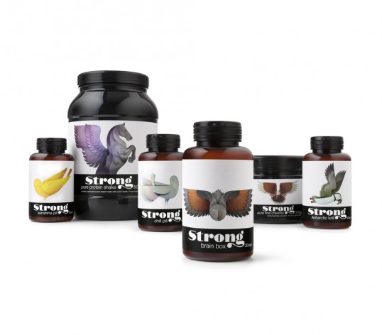
Karen Welman, Founding Partner and Chief Creative Officer at Pearlfisher commented, “The idea was to create an impactful visual story using the metaphor of beautiful and elegant birds that have hidden strength. The brand name – Strong – and the playful variant names and descriptors are simple yet impactful and clearly communicate the brand’s promise of inner strength and outer beauty.”

“Pearlfisher created custom hand-drawn typography for the brand name and commissioned a series of bespoke bird illustrations that bring to life the product benefits in an unexpected and emotive way. For example, for ‘brain box’ an owl was used to represent how the powerful combination of cutting edge nutrients promotes optimal brain performance, whilst a bright yellow canary was used for the ‘sunshine pill’ to illustrate the end benefit of a radiant, healthier immune system and stronger bones.
The end result is visually arresting creating strong visibility both in retail and online environments.” Pearlfisher also developed the communications material and the brand website for Strong which is currently under development and will be launched soon.”