Designed by: PepsiCo Design & Innovation
Country: United States

Student Work – Adam Paterson and Santi Tonsukha

growyourown01

Designed by Adam Paterson and Santi Tonsukha | Country: United Kingdom

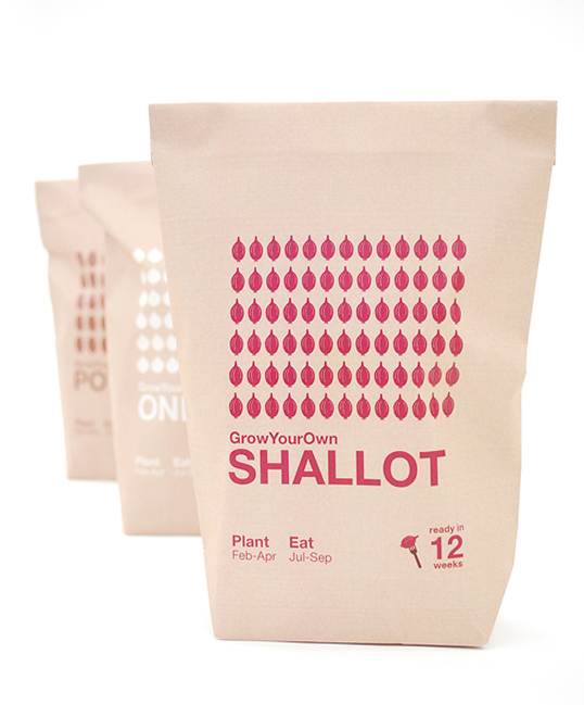
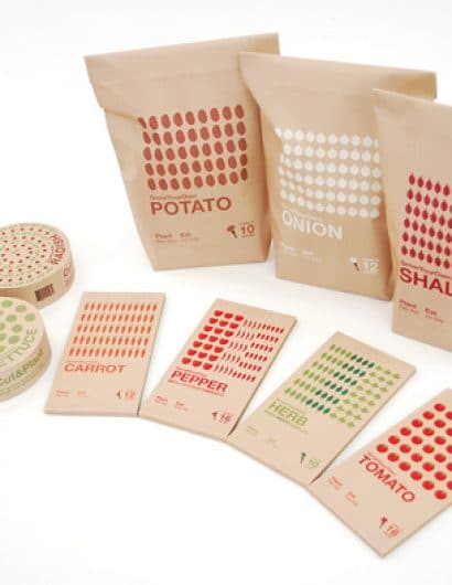
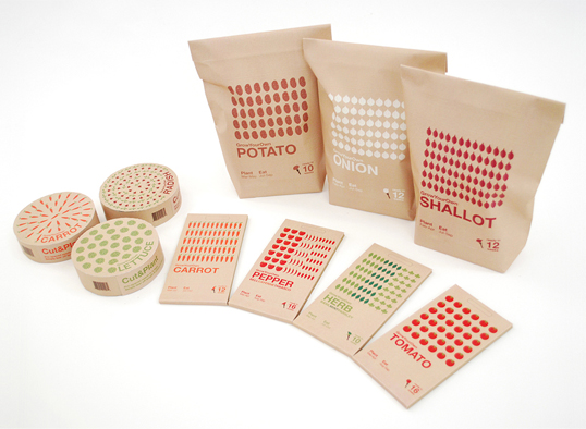
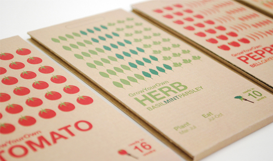
 Adam Paterson and Santi Tonsukha, students from the Royal College of Art have sent us in some images of their latest project ‘GrowYourOwn’, packaging for fruit and vegetable seeds for novice gardeners. This range of packaging works extremely well, the combination of clean attractive graphics with simple sustainable materials compliment how well each individual piece fulfils its purpose perfectly. Having won the ‘In-Book’ award for the D&AD student Awards 2009 we are eagerly awaiting their forthcoming projects.

 Designers’ own words:

‘A single piece of 100% recycled corrugated cardboard is the package.

Research showed that users didn’t use all the seeds in a pack at once.
The new packaging is easily re-sealable. Insights also suggested that
an allotment grower generally doesn’t want to grow/eat a large number
of crops of the same variety. The new packaging can hold a variety of
seeds, separately, in one pack, utilizing the corrugated structure of
the cardboard as natural dividers.

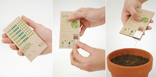
With previous seed packaging, distributing the seeds evenly from the
pack was very hard. By using the corrugated structure the seeds are
held in thin rows, which are the perfect ‘v’ shape to allow them to be
very easily and controllably shaken out.

It can be tedious and boring laying out rows of seeds whilst trying to
maintain equal spacing. The new measuring tape style, which the DIY
savvy customer can easily relate, makes it much quicker and easier.
The tape, with its embedded seeds, has 10 cm markers on it, making it
easy to simply pull out the desired length, tear it off and lay it in
the ground.

The packaging for bulbs is reminiscent of brown paper sacks, creating
a mental link with what the consumer is used to seeing/buying the
fully-grown vegetable in.

The natural matte colour and aesthetic of the cardboard creates visual
differentiation from the other packages that present too much
information and can be overwhelming and intimidating as a result.’


growyourown05


growyourown02


growyourown03


growyourown04

Get the latest packaging design inspiration in your inbox:

Popular designs

The Port Vodka Lemon Water

Overview: In response to my client’s vision for a Cape Cod themed beverage brand, I embarked on the journey to create The Port

Pure Persian Honey

When we look closely at honey packaging, they are almost all in the usual format, and the ultimate in creativity is that

Over the wave

This Kombucha originates in Lombok, Indonesia, where its paradise beaches attract hundreds of surfers eager to ride the waves. When you surf,

Far Out Bar

Description: Far Out Bar is a cutting-edge packaging design project created for High Life Farms’ macrodose THC chocolate bars. This project involved

Designed by: PepsiCo Design & Innovation
Country: United States

Student Work – Adam Paterson and Santi Tonsukha

growyourown01

growyourown01

Designed by Adam Paterson and Santi Tonsukha | Country: United Kingdom

 Adam Paterson and Santi Tonsukha, students from the Royal College of Art have sent us in some images of their latest project ‘GrowYourOwn’, packaging for fruit and vegetable seeds for novice gardeners. This range of packaging works extremely well, the combination of clean attractive graphics with simple sustainable materials compliment how well each individual piece fulfils its purpose perfectly. Having won the ‘In-Book’ award for the D&AD student Awards 2009 we are eagerly awaiting their forthcoming projects.

 Designers’ own words:

‘A single piece of 100% recycled corrugated cardboard is the package.

Research showed that users didn’t use all the seeds in a pack at once.
The new packaging is easily re-sealable. Insights also suggested that
an allotment grower generally doesn’t want to grow/eat a large number
of crops of the same variety. The new packaging can hold a variety of
seeds, separately, in one pack, utilizing the corrugated structure of
the cardboard as natural dividers.

With previous seed packaging, distributing the seeds evenly from the
pack was very hard. By using the corrugated structure the seeds are
held in thin rows, which are the perfect ‘v’ shape to allow them to be
very easily and controllably shaken out.

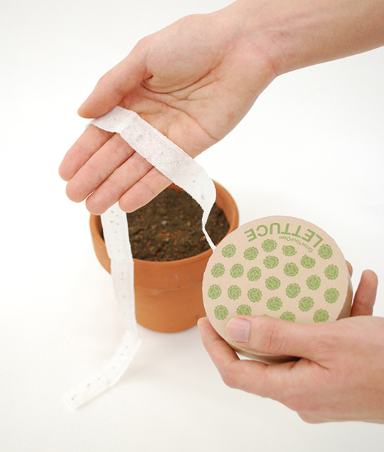
It can be tedious and boring laying out rows of seeds whilst trying to
maintain equal spacing. The new measuring tape style, which the DIY
savvy customer can easily relate, makes it much quicker and easier.
The tape, with its embedded seeds, has 10 cm markers on it, making it
easy to simply pull out the desired length, tear it off and lay it in
the ground.

The packaging for bulbs is reminiscent of brown paper sacks, creating
a mental link with what the consumer is used to seeing/buying the
fully-grown vegetable in.

The natural matte colour and aesthetic of the cardboard creates visual
differentiation from the other packages that present too much
information and can be overwhelming and intimidating as a result.’


growyourown05


growyourown02


growyourown03


growyourown04

Previous slide
Next slide

Explore more great package design

Get the latest on packaging design in your inbox: