Designed by Allison Chambers | Country: Canada
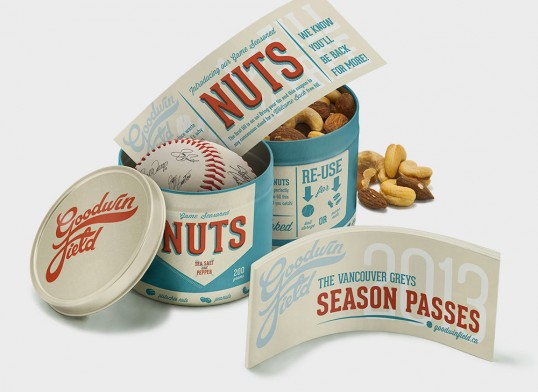
“In addition to brand development, this project called for creating a strategy to reduce packaging waste at baseball games. Nostalgic script from by-gone days inspired the logo. Fans can re-use their ‘Game Seasoned Nuts’ tin game after game, or even store a prized baseball. Season ticket holders get the branded tin holding their tickets, a coupon for nuts, and a baseball signed by the players. The goal of the project is to increase loyalty and fan base, while developing a sustainable, environmental solution.”


“I developed this brand concept for a new wine company to be a playful verbal and visual pun. The intended audience is young women who like to get together to commiserate over a glass of wine. I mimicked the feel of whiny voices with a distorted treatment of two typefaces. I drew familiar whines from real life to wrap around the bottle. From a distance, they act as a texture, but close up they become easily legible. The bottle invites customers to participate and add their own favourite whines to the conversation on twitter, using the hashtag #grapewhines.”


“This packaging is part of a brand strategy for Cite Art, Design, and Culture Publications, a concept for a new high-end art bookstore in Vancouver. Artists and writers create to evoke emotion, stimulate thought, and provoke response. That is also Cite’s raison d’être.
For Cite’s in-store packaging, I gave the pieces a clean, slightly industrial feel, similar to a gallery space before artwork is hung. This influence led me to a straight-forward, descriptive treatment of the graphics on the packaging, where what is inside is shown graphically and to scale on the packaging. I utilized the brand colours, typefaces, and form of the logo on the packaging, to maintain integrity across the brand, while avoiding any sense of facade or ornament. The packaging relies on form and function, to maintain credibility with its target market of educated, creative professionals.”


“Band Together is a packaging concept for adhesive bandages to be sold as a charity fundraising item, supporting disaster relief initiatives. The wordmark represents the connection between supporters of the charity and its recipients. Transparent packaging reveals the causes the charity supports, for example hurricane clean-up, medical assistance, and clean water supply. I used ligatures and connected type treatments to represent healing of wounds, and healing of communities in need. The wordmark is printed on the bandages, so the wearer shows their support for the charity whenever they wear one.”