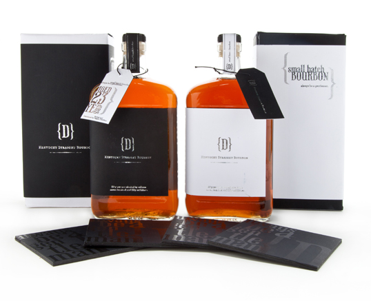
Student Work – Amy Dick
June 6, 2011 | 2 Comments
Designed by Amy Dick | Country: United States
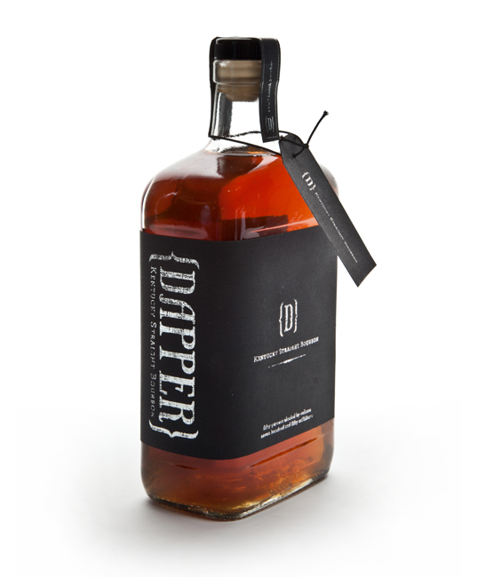
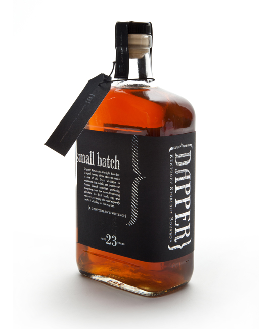
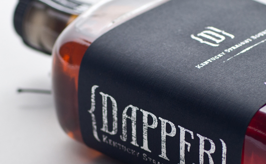
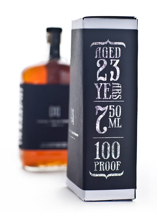
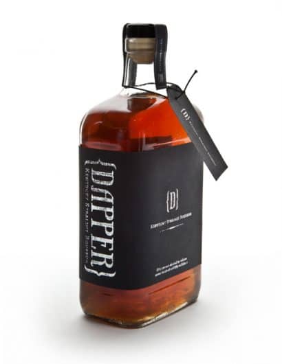
“Dapper is a small batch bourbon company that combines vintage with modern. It is for the contemporary gentleman. The whiskey should not only be suited for a gentleman but the packaging should also accessorize the modern gentleman. The name Dapper was influenced by the slang word used in 1920’s. The labels were created with an elegant touch of linen textured paper and the use of metallic lettering.”
Comments
Warning: count(): Parameter must be an array or an object that implements Countable in /nfs/c02/h06/mnt/28959/domains/lovelypackage.com/html/wp-includes/class-wp-comment-query.php on line 399
2 Responses to “Student Work – Amy Dick”
Your Comment
June 6th, 2011 @ 8:35 am
Very awesome, but I’m mostly just a sucker for that typeface. If anyone’s wondering where they can get it: http://marketplace.veer.com/type/umt0000447
(no, I’m not associated with Veer or Phaeton. It’s just a favorite of mine)
June 7th, 2011 @ 9:28 am
The typeface is super nice @JustinRoss! I really like the shape of the bottle and quality of the label.