Designed by Barysheva Yana | Country: Russia
“Elixir was chosen as the brand name as it is widely known to represent eternal life, immortality, and well being. The brand logo was then set out in a clear and sharp font representing an up market professional appearance that will appeal to a broad consumer market.
In addition the logo includes the Latin slogan In Aqua sanitas this is taken from the Latin saying “In vino veritas, in aqua sanitas” . “In whine there is truth In water Their is health”. This combined with Elixir adds to the overall feeling of health, youth and vitality. To complete the Logo the words Vitamin Water are clearly displayed to insure the consumer understands and relates to the product and its contents.
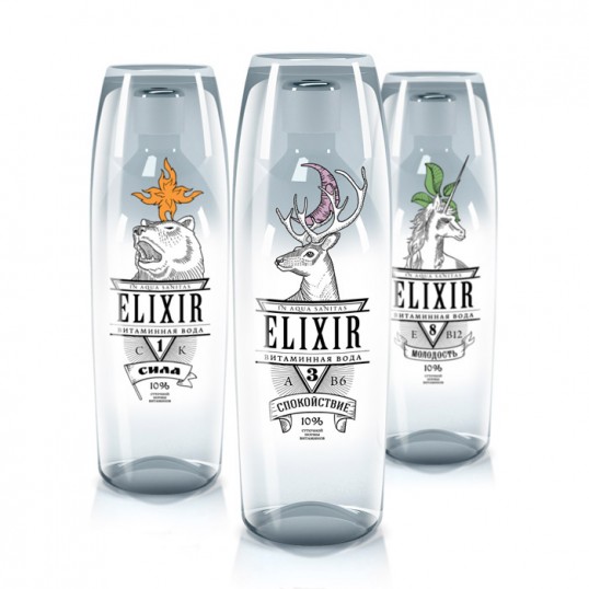
The brand is divided into 3 varieties each with, A different symbol, Animal, number, vitamin content, and subtitle name that all directly represents the benefits of the individual products. The symbols, numbers, and animals have been carefully selected and combined to create visually attractive graphics. Each with deep symbolic meaning, enabling consumers to relate to the benefits of each product on offer.”

“ELIXIR #8 – YOUTH
Represented buy the unicorn, the plant, and the number 8. The Unicorn symbolizing the spirit of purity, innocence, and youth. Legends containing the unicorn states that only a young pure female could attract a unicorn to become visible and be of this reality. The plant symbolises new life vitality and prosperity. And the number 8 in numerology represents youth.
This product contains 10% of your daily vitamins E and B12. E is a natural antioxidant and B12 Supports natural energy production and reduces tiredness and fatigue. Helping the consumer feel youthful and full of vitality.”

“ELIXIR #3 – TRANQUILITY
Represented buy the Deer the Moon and the number 3. The Deer is a symbol of the human soul, sanity, love, serenity, grace and piece. The moon is a sign of perfection beauty and peace the symbol of cyclicity (the quality of recurring at regular intervals and revival) And the number 3 in numerology represents piece and tranquillity .
This product contains 10% of your daily vitamins B6 and A. Vitamin B6 has many benefits in the body including support for the Nervous system, brain function and the formation of red blood cells. And Vitamin A helps Bone metabolism Skin and cellular health Antioxidant activity. Helping the consumer feel tranquil and healthy.”

“ELIXIR #1 – POWER
Represented buy the bear Fire And the number 1. The bear symbolises kindness, courage, heroic strength, and greatness. Fire is a symbol of vital energy, fertility, the personification of the sun, man, and is one of the primary elements of the universe. And the number 1 in numerology represents power.
This product contains 10 percent of your daily vitamins C and K. Vitamin C contributes to the reduction of tiredness and fatigue Vitamin C increases iron absorption. And vitamin K contributes to the maintenance of healthy bones and blood. Helping the consumer feel strong and powerful.”

“The product design incorporates an innovative concept allowing the consumer to drink from a provided stylish glass rather then having to drink out of a bottle. This design has three main components the bottle, the glass, and the plastic sleeve each with a different function, and layers of graphics.
The bottle is designed to fit seamlessly inside the glass which is held firmly in place buy the plastic sleeve. when all three components are in place the logo is formed of the three transparent layers which can be seen through one another: the symbol on the glass, the logo on the bottle and the animal and the logo on the sleeve.
When the product is disassembled each item is left with an individual layer of graphics but all still directly relates to the brand.”