Student Work – Dong Heuk Choi
June 16, 2010 | 14 Comments
Designed by Dong Heuk Choi | Country: Australia
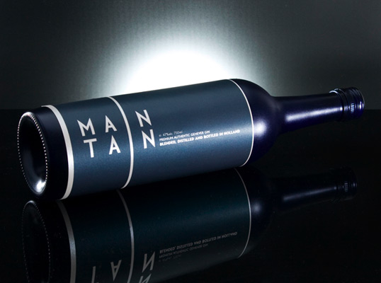
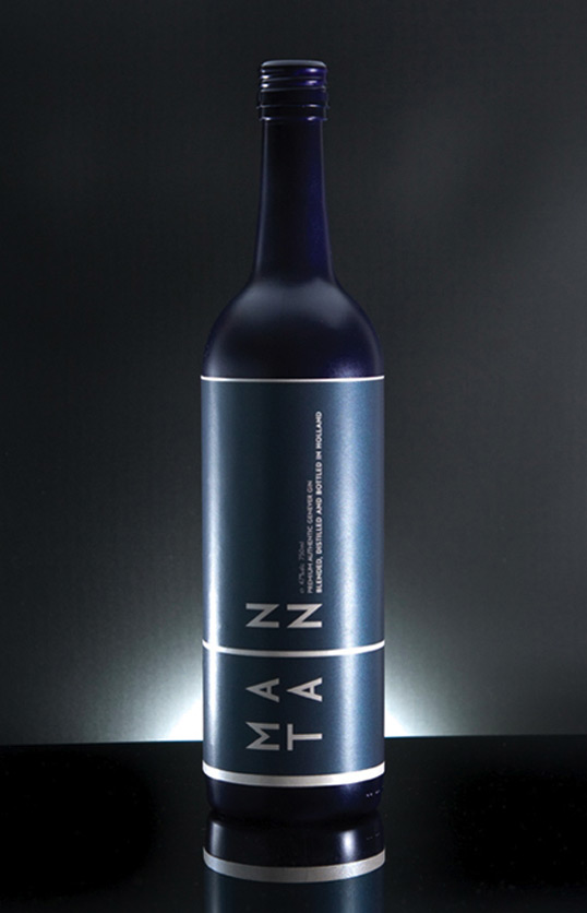
“Maintain is a premium line of Genever Gin, the preferred Gin of cocktail aficionados, targeted towards professional gentlemen in their late thirties. Maintain is blended, distilled and bottled in Holland, the home of Genver Gin.
The sparkling deep blue bottle and label is perfect for the gentleman who enjoys premium quality beverages.”
Comments
Warning: count(): Parameter must be an array or an object that implements Countable in /nfs/c02/h06/mnt/28959/domains/lovelypackage.com/html/wp-includes/class-wp-comment-query.php on line 399
14 Responses to “Student Work – Dong Heuk Choi”
Your Comment
June 16th, 2010 @ 9:23 am
Hi,
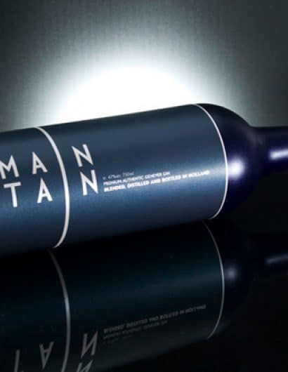
I think you have gotten the masculineness spot on with the colours and font. However at first and possibly second glance it reads Man Tan.
I maybe would have but circles where they would be on the i on the band.
June 16th, 2010 @ 10:58 am
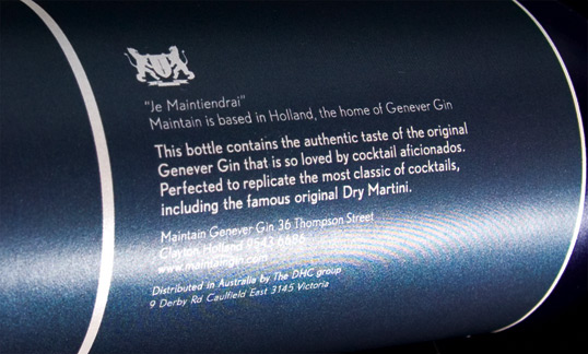
I do like the typography, but I read it as ‘man tan’… Also, what is the purpose of the French on the bottle?
June 16th, 2010 @ 12:28 pm
I hate to say it.. I just read Man Tan
June 16th, 2010 @ 12:56 pm
Design looks clean, and I like the colors. I’m not sold on the logotype though. I do not get the word “maintain” from it because the word is just too broken up. I read “Man Tan.”
June 16th, 2010 @ 1:49 pm
I’m sorry…but this says Man Tan.
June 16th, 2010 @ 2:08 pm
I swear I thought it was “man tan”
June 16th, 2010 @ 4:04 pm
I have a Man Tan.
June 16th, 2010 @ 11:00 pm
Thanks for the feedback all. I see that readability of the logo is an issue which I will have to fix.
@Ben “Je Maintiendrai” (meaning I will Maintain) is how it is written on the banner of the Netherland crest.
June 17th, 2010 @ 4:38 am
Looks great. The Man Tan thing is easily solved just add two dots of the i’s. However, the rest is upper case.
Good luck
June 17th, 2010 @ 5:28 am
Yeaaah, I’m gonna have to agree on the whole “Man Tan” thing. The color scheme and the type is spot on otherwise. Maybe if the tracking were a bit tighter?
June 17th, 2010 @ 7:39 am
bonito diseño, pero yo tambien leí Man Tan 😀 un par de circulos que interrumpan la linea serían un aporte interesante 😀
June 17th, 2010 @ 9:32 am
Finally! A student is using this site as a way to critique their work and make the appropriate changes instead of just looking for a slap on the back. Good start on the label and way to go on listening to the advice of others.
June 21st, 2010 @ 12:01 pm
I read Man Tan. So, to be helpful…
Aside from the legibility from the wrap around “I” line, another problem is the kerning. There is too much space between the line and the A’s and N’s. I believe this is accentuating the problem.
Take this into consideration as you make revisions.
June 23rd, 2010 @ 8:23 pm
I love the design. Please, do not add the circle or dot to make it appear as an “i.” I absolutely love the overall look of this. Sophistication and maturity is what comes to mind but also chic.
Just my two cents.