Student Work – Ekta Mody
August 12, 2010 | 12 Comments
Designed by Ekta Mody | Country: United States
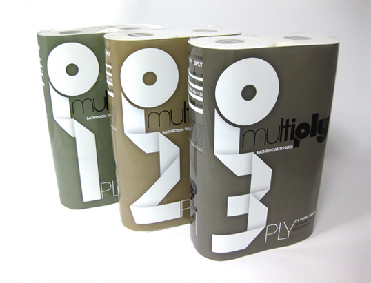
“The assignment was to design the branding and package for a challenging consumer product. I chose toilet paper as a majority of consumers including myself struggle most often to find the details of the thickness/quality on the product package. My research showed me that most existing packages focus on the brand name, soft colors and comforting graphics, thereby making it difficult for the onlooker to get important details regarding the product from a distance.
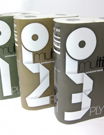
I named the brand MULTIPLY, as toilet paper is available in a variety of thicknesses or plies that increase the hygiene and comfort value. Attempting to solve the simple issue of convenience for the buyer, I decided to focus on the info graphic 1ply, 2ply and 3ply. This series of 3 packs clearly identifies each quality at a single glance on the shelf while indicating the product itself through the visual language.”
Comments
Warning: count(): Parameter must be an array or an object that implements Countable in /nfs/c02/h06/mnt/28959/domains/lovelypackage.com/html/wp-includes/class-wp-comment-query.php on line 399
12 Responses to “Student Work – Ekta Mody”
Your Comment
August 12th, 2010 @ 10:00 am
I really like how you treated the numbers, I just would like to see if you tried using colors more often associated with toilet paper.
August 12th, 2010 @ 11:20 am
An awesome idea! Really nice work.
August 12th, 2010 @ 1:57 pm
how much on a roll, that’s what the people are looking for. even do, the 1, 2, 3 ply is nice.
August 12th, 2010 @ 9:13 pm
Ekkuu Niiicee
August 13th, 2010 @ 1:50 am
Great job, looks really nice. Agree on the colors.
August 14th, 2010 @ 1:54 am
great work
August 14th, 2010 @ 4:27 am
Lovely concept and design. The fonts seem original and conform to the visual of toilet paper rolls being unfolded. Liked the muted colors too which would stand out among the other highly colored rolls in a super market.
Excellent work
August 16th, 2010 @ 9:24 pm
Wow… brilliant..
August 17th, 2010 @ 2:01 pm
I like it. I think these colors ARE associated with toilet paper (if you know what I mean.)
August 17th, 2010 @ 5:27 pm
i think unless you are into design/fonts or whatever you might not really get/see it to be honest. i mean i agree with your observation that its often hard to find details on existing packaging. i dont think though your approach solves that problem. looking at these not as a group but as a single pack especially. i dont think eg my grandmother would necessarily notice the one spelled in paper. i like this, yes. but seeing what type of product were dealing with i dont thinks its very fitting.
February 5th, 2011 @ 8:08 am
Ingenious! Always nice to have design based on solid research… Good job Ekta!
July 7th, 2012 @ 10:37 am
Very Nice Ekta . Loved the design .