Designed by Erica Craig | Country: Canada
“A (fictional) winery in the Okanagan Valley wanted to create a unique and sustainable brand identity that embodied the youth and beauty of British Columbia.
The product is targeted towards males and females ages 25+. The whole inspiration behind the design of Kingswood stems the company wanting to create a sustainable brand. BC is known for it’s bountiful forests and I wanted to capture that but in a freshly refined way. I created a brand that focuses on showcasing the quality of the product by using a timeless, gender-neutral design.
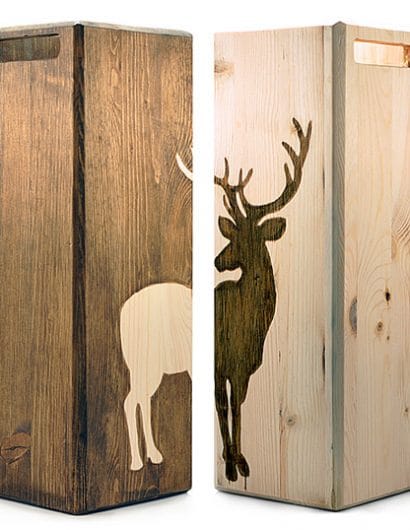
The name Kingswood is very noble and pairing it with a clean sans-serif font for the logo type says that this product is the new royalty of wines. The Stag was chosen to be symbol because of its bountifulness in BC as well as the majestic presence the animal has. The stance of the stag had to be elegant, non-aggressive but not too docile in order to keep the feeling gender-neutral. The frosted wood grain on the bottles encourages consumers to pick them up and interact with them.
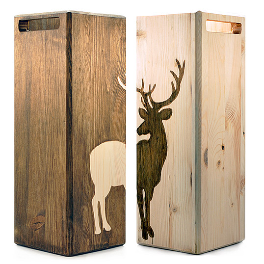
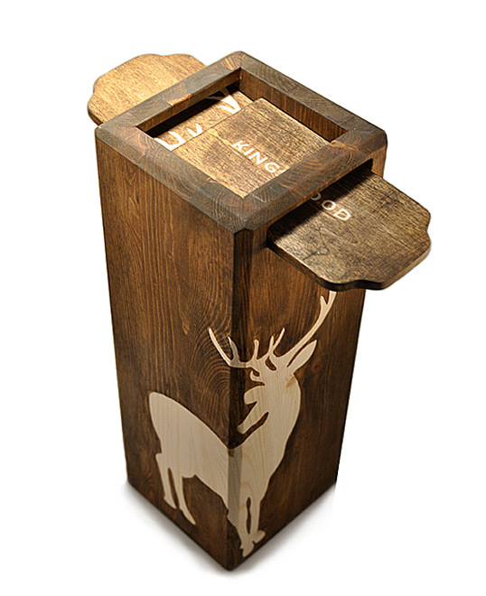
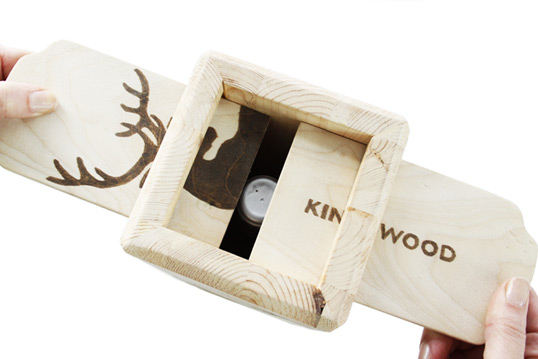
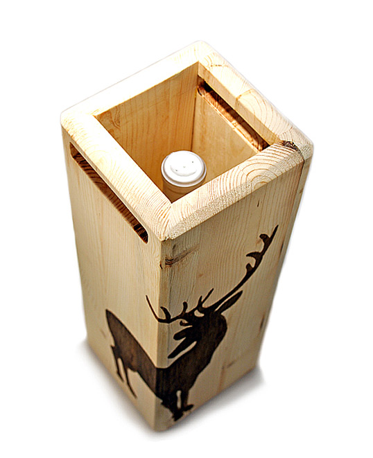
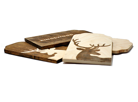
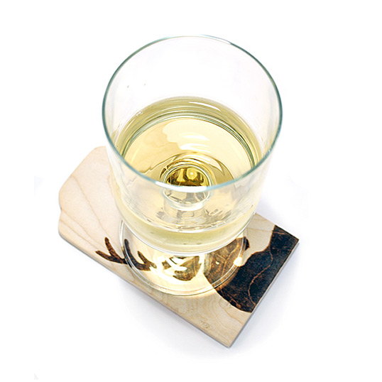
The launch strategy is to first introduce the brand through strategic promotional programs. In-store displays would showcase the limited time offer packaging, reusable and repurposed pine-beetle wood boxes with the symbol of the stag stained onto it. The offer would be available for three weeks and after that would be sold as a special edition gift pack. Whenever a new red or white wine is launched the same promotion will take place but the stag will be cropped in different areas and the packaging will be something the consumer can collect and reuse as coasters, a vase or even hang on the wall. The placement of the stag will always be on the corner of the wine box so that it is possible to mix and match them.”

